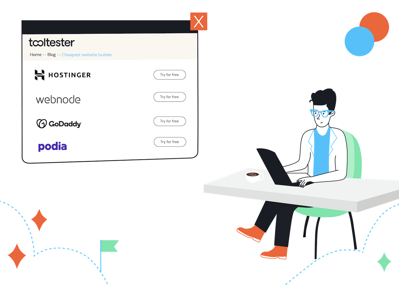
The Cheapest Website Builder in 2025: 15 Tools to Discover!
Times have changed. There’s no reason why launching your own website should cost an arm and a leg. You could, of course, ask someone to design the website for you, but our...


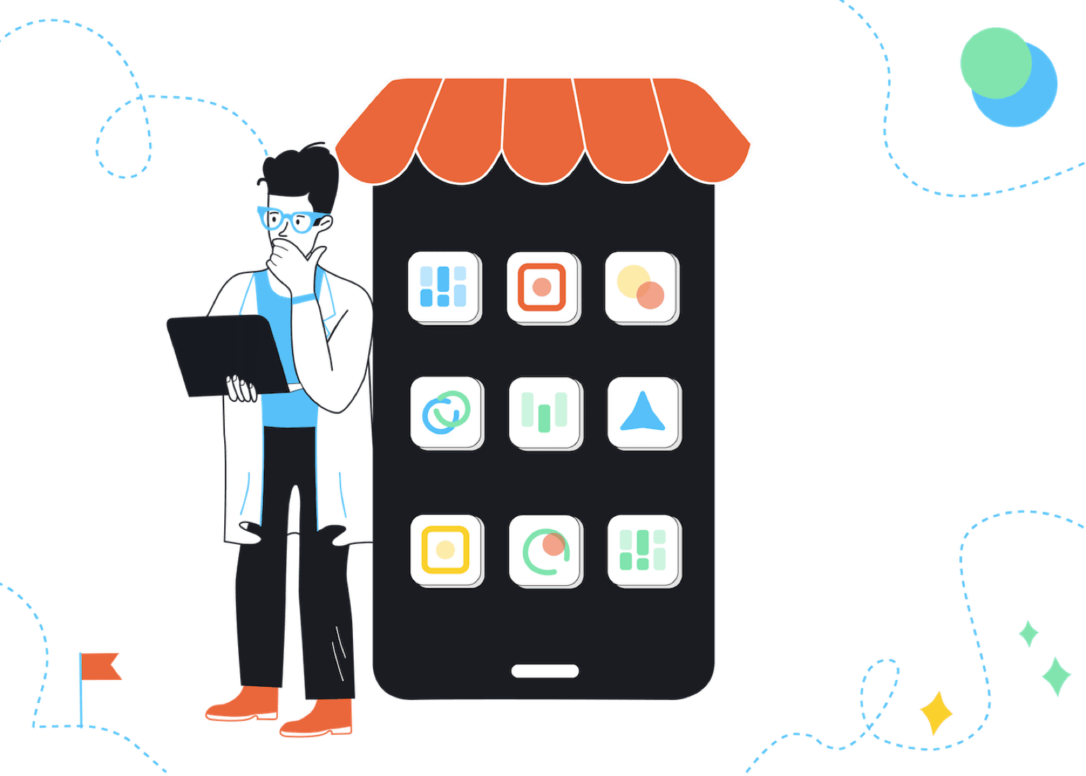
13 Best Small Business Marketing Tools (Proven to Work)
The best small business marketing tools will support rapid growth, even if you’re running the whole show by...
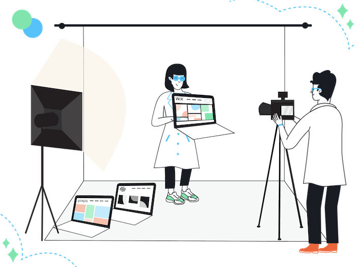
Best Website Builder for Photographers Showcase and Sell Your Work with Minimal Effort
Ready to turn your passion for photography into more than just a side hustle? Or, maybe you’ve outgrown...
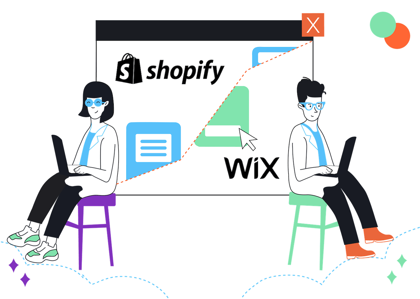
Shopify Vs Wix Ecommerce Champion or Website Builder Superstar?
Shopify vs. Wix may seem like comparing apples to oranges. We get it: Shopify is the go to...
Squarespace Alternatives (2025) The 16 Best Website Builders
If you’ve been researching ‘best website builders’ on Google, you probably would have seen Squarespace topping a few...
Squarespace vs. Weebly (2025) Who Will Make The Best Websites?
If Squarespace and Weebly were salespeople, they’d have very different personalities. Weebly would be humble, understated, maybe quietly...
Shopify vs. Etsy Which Platform Is Better For Selling Your Creations?
The popularity of crafts has surged in recent years, with millennials spearheading the trend. People are willing to...
11 of The Best AI Website Builders Do they live up to the hype?
AI-powered digital tools are nothing new, with AI website builders being around for a few years now. But...
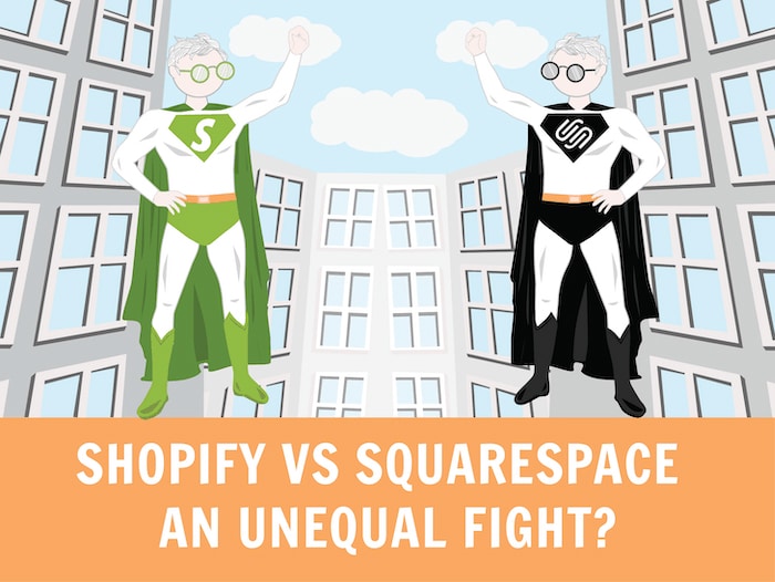
Shopify vs Squarespace Who is Your Online Store Super Hero?
If you are reading this article, I assume you are looking into building an online store. Why you...
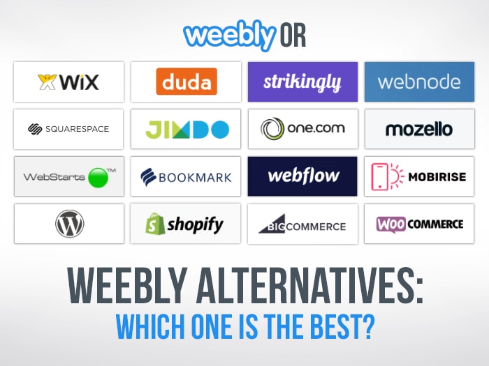
The 18 Best Weebly Alternatives Weebly is falling apart – what else is there?
Let’s get one thing out of the way: we really used to like Weebly. They regularly took the...
Website Creation Guide for Absolute Beginners
We wrote this ebook especially for beginners who want to create their own business website. You’ll be surprised how simple this can be.
The information in this ebook means you won’t need to learn programming or spend a fortune on a developer. There’s a good chance that you’ll have fun creating your website too!