One key aspect of having a website today is that it is perfectly accessible and easy to use on a variety of devices, including smartphones, tablets, and desktop computers.
With this in mind, you may be wondering: does Wix offer responsive templates for its websites?
The short answer is no, not exactly. There is even an open feature request on their website you can vote for.
But that doesn’t mean your websites are going to look bad. Because even though Wix isn’t responsive in the classical sense, they do optimize their websites for smartphones, tablets and desktop computers alike.
Our general advice for that reason is that you don’t need to worry about it if you are running a smaller website (up to 30 pages).
But first things first:
What is a Responsive Website?
Essentially, a responsive website is one that is designed to adapt to the screen size and device it is being accessed on. This means that the layout and content of the website will automatically adjust to provide the best possible experience for the user, regardless of whether they are accessing the site on a smartphone, tablet, or desktop computer.
The easiest way to check whether a website is fully responsive is making the browser window smaller, as you can see here:

One key element of responsive web design is the use of flexible grid layouts and flexible images and media.
This allows the website to adjust to different screen sizes and resolutions, ensuring that the content is displayed in a way that is easy to read and navigate. The video also shows that at a certain size, the menu changes into a hamburger menu (the three bars on top of each other).
Wix’s Mobile-Optimized Website View
So, as we’ve learned before, Wix’s websites are not fully responsive in the traditional sense.
So what about their mobile-optimized view?
When a website built with Wix is accessed on a mobile device, it will automatically switch to a mobile-optimized view. This view is designed to make the website more easily navigable on a smaller screen, with elements such as menus and buttons being reorganized and resized to make them easier to tap with a finger.
And as you can see here with my own Wix website, it actually looks pretty good, even on the tablet:
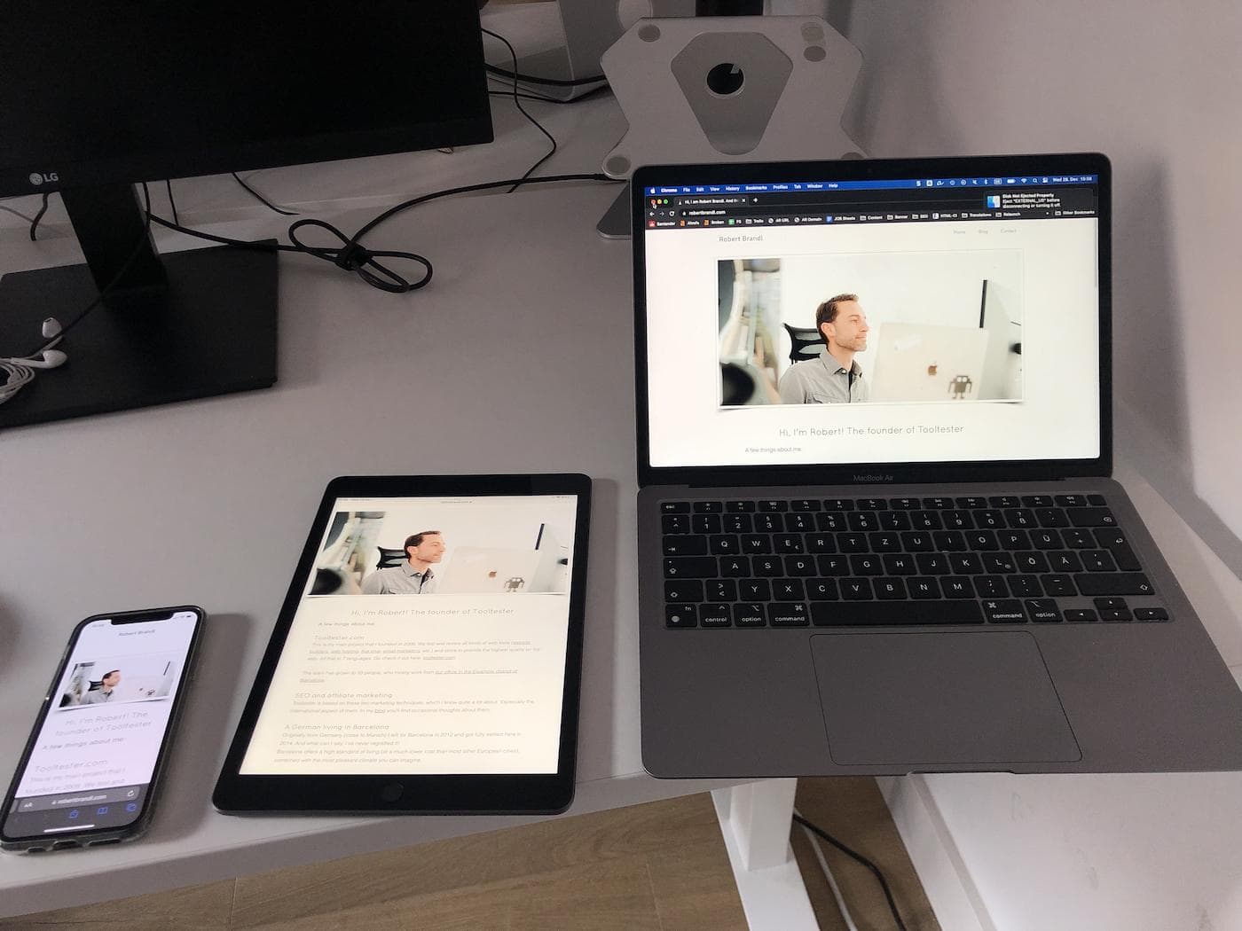
Viewing my own Wix website on different devices
However, this mobile-optimized view is not fully responsive in the way that a website designed with responsive web design techniques would be. It does not automatically adjust to different screen sizes and resolutions, as you saw in the video above.
But is that really a problem?
Yes and No.
Wix solves the issue rather elegantly. Each device received an optimized version of the website. In 90% of the cases, their templates will look great, just like a responsive website.
But there’s the other 10% of cases. To find out what going on there, we need to learn more about Wix’s mobile editor.
How does Wix’s mobile editor work?
Just like with all the other website builders, you generally work on the desktop version of your website. What makes Wix special is that there is also a mobile website editor.
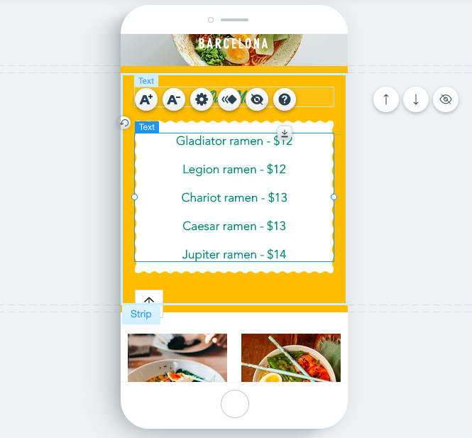
Wix’s mobile editor
This has an advantage: you can tweak your mobile website version and even remove certain elements that aren’t necessary on smaller screens. There aren’t many other website builders that allow you to do that.
But there is also a disadvantage: even though in theory Wix converts the desktop site into a mobile website automatically, it doesn’t always work perfectly. Sometimes you end up with overlapping or misaligned elements. Usually, it’s not a big issue to fix this – once you’ve found the error. But that means you always need to check the mobile version after publishing any kind of design change.
So, especially if you are trying to build a larger website (I am talking about 30+ pages), you may want to consider a website builder that produces fully responsive websites. I would recommend you to also check out our Wix review for further details.
Alternatives to Wix for Creating Fully Responsive Websites
If you are looking to create a fully responsive website that provides the best possible experience for users on all devices, there are several alternatives to Wix that you might consider. These include:
- Squarespace is known for its sleek, modern designs. All of its templates are fully responsive, meaning that your website will look great on any device.
- Zyro’s editor is actually similar to Wix, but there is one difference you might like. While there aren’t as many themes available as with Wix, they’re all fully responsive!
- Weebly’s templates are designed to automatically adjust to different screen sizes and devices, as we’ve seen in the video above. The downside here is that their theme selection is very limited.
- WordPress: WordPress is a popular content management system that is known for its ease of use and wide range of customization options. It offers a variety of responsive themes and templates that can be used to create a fully responsive website.
- Webflow is geared towards designers and offers very granular design options that may be complicated to use for a beginner. All of their templates are fully responsive.
- Editor X although made by Wix is an entirely different editor, which is similar to Webflow. In addition to its responsive templates, Editor X also offers a wide range of customization options.
For more details, head on over to this post: The 6 Best Responsive Website Builders
When comparing these alternatives, it’s important to consider factors such as cost, ease of use, and the features and customization options that are available. Some website builders, such as WordPress, may have a steeper learning curve, but offer a wider range of customization options. Others, like Weebly, may be easier to use but may not offer as much flexibility in terms of design and functionality.
I hope this was helpful! Please let me know if you have any further questions
There are several ways to test whether your website is responsive. One option is to use a website like Responsinator, which allows you to see how your website looks on different devices.
You can also manually test your website on different devices by resizing your browser window or accessing the website on different devices.
The author
Learn more about us
THE BEHIND THE SCENES OF THIS BLOG
This article has been written and researched following a precise methodology.
Our methodology