Tooltester is supported by readers like yourself. We may earn an affiliate commission when you purchase through our links, which enables us to offer our research for free.
We’ve said it once, and we’ll say it again.
Despite being a newcomer, Hostinger Website Builder (previously called Zyro) packs a lot of punch in the website-building ring. It’s still far from becoming a heavyweight like Wix, but it’s showing signs of becoming a serious contender in the future.
This may make you wonder: What’s it like in action?
Given that it’s one of the cheapest website builders on the market, some may assume that it can only create basic websites. But we’re happy to report that it’s not the case.
In this post, we’ve put together 26 Hostinger Website Builder examples that showcase the platform’s ability to deliver great designs without compromising on affordability.
26 Examples That Demonstrate Hostinger Website Builder’s Versatility
It doesn’t matter if you need the site builder to create an online nook for your store, portfolio, restaurant, or agency – Hostinger comes preloaded with tools for building an online presence. Still not convinced? Draw inspiration from this list of example websites.
1. Millaw Kids
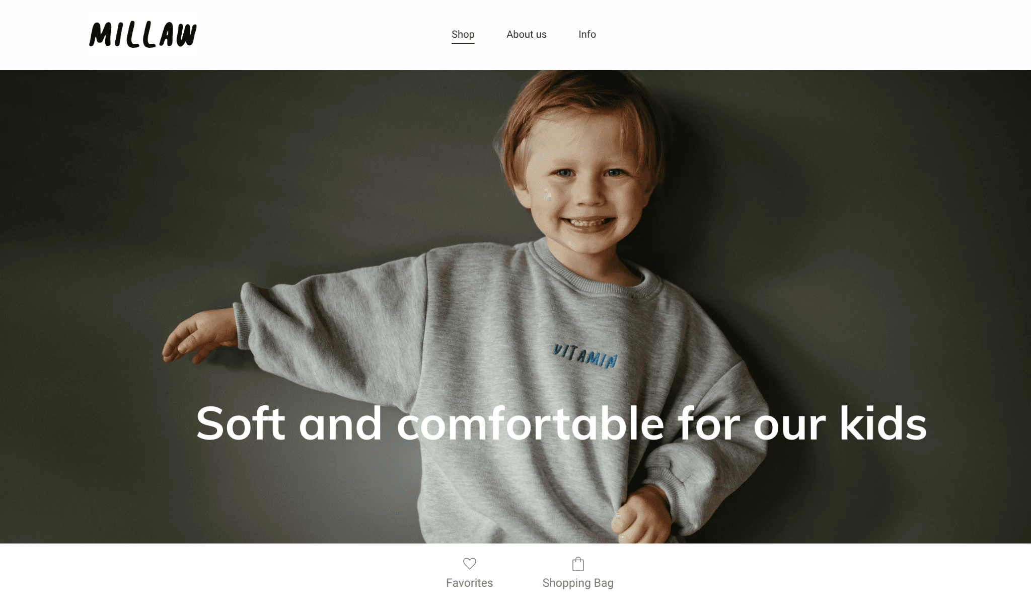
Millaw Kids’ Homepage
With a hero image of a young boy and a clever slogan across it, Millaw Kids’ website tells the whole story. A quick scroll under the image reveals a thumbnail display of their children clothing products, which you can purchase now or save for later, thanks to Hostinger’s ecommerce functionality.
It’s a small website, with each page serving a purpose. Aside from the homepage (which doubles as the shop), the About Us and Info pages give viewers a quick overview of the brand, the ordering process, and their Instagram feed.
Tip: Make sure the hero image communicates what your business does well. A strong image and powerful statement will set the mood for your visitors.
2. Shleps
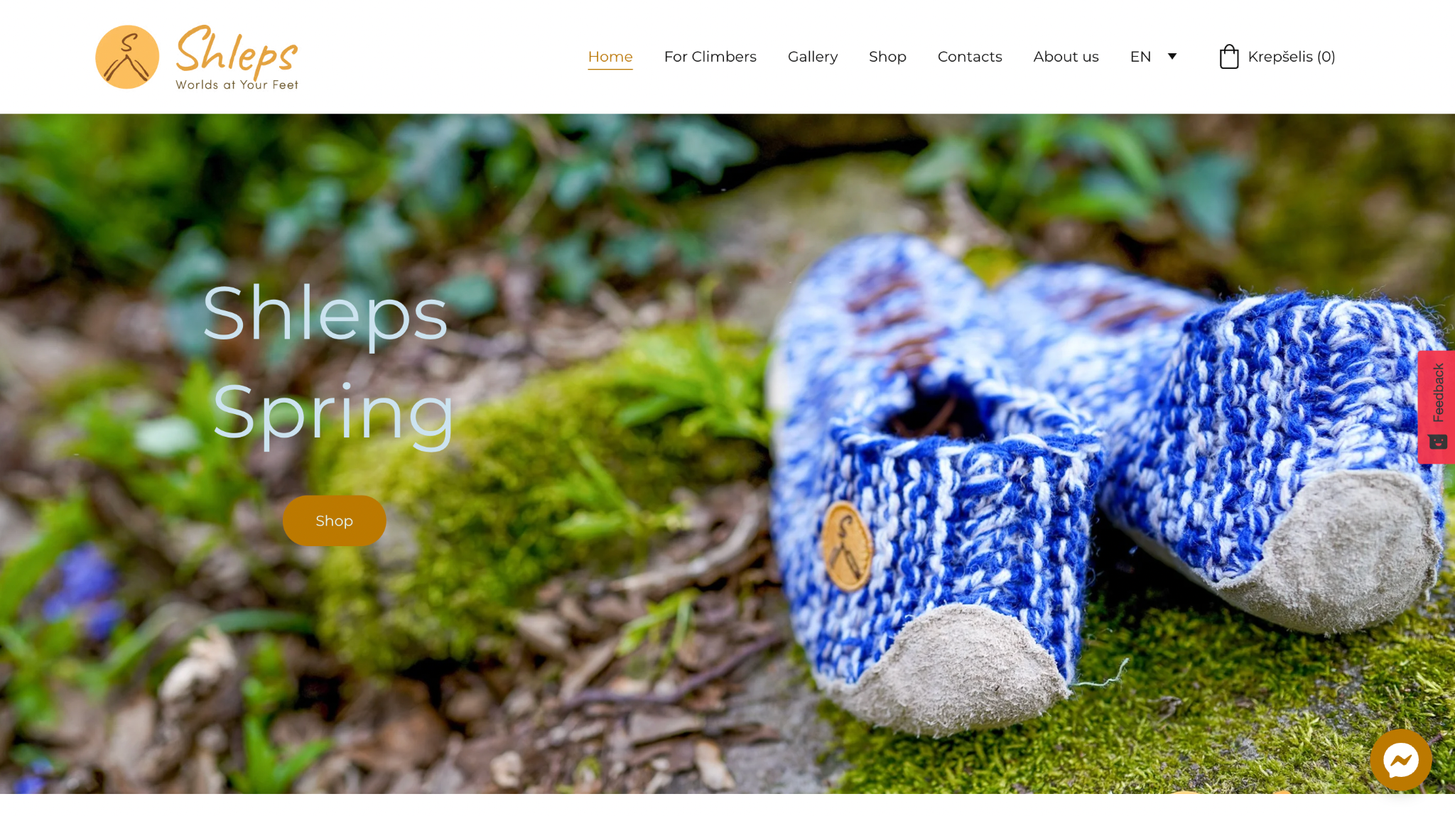
Shleps’ Homepage
Shleps is reinventing climbing shoes. Instead of bulky, rubbery pairs, this Lithuanian brand gives active climbers a fun and exciting alternative.
These qualities are reflected in their website, which is a visual feast. Color-rich images are peppered across multiple pages. You can also check out their gallery, which displays the shoes in various colors and backdrops.
Shleps makes it easy to purchase their products–which are handmade–via the shop, a contact page, and a Facebook Messenger chat button.
Tip: Use a consistent color palette to establish a cohesive online brand identity.
3. Pwood
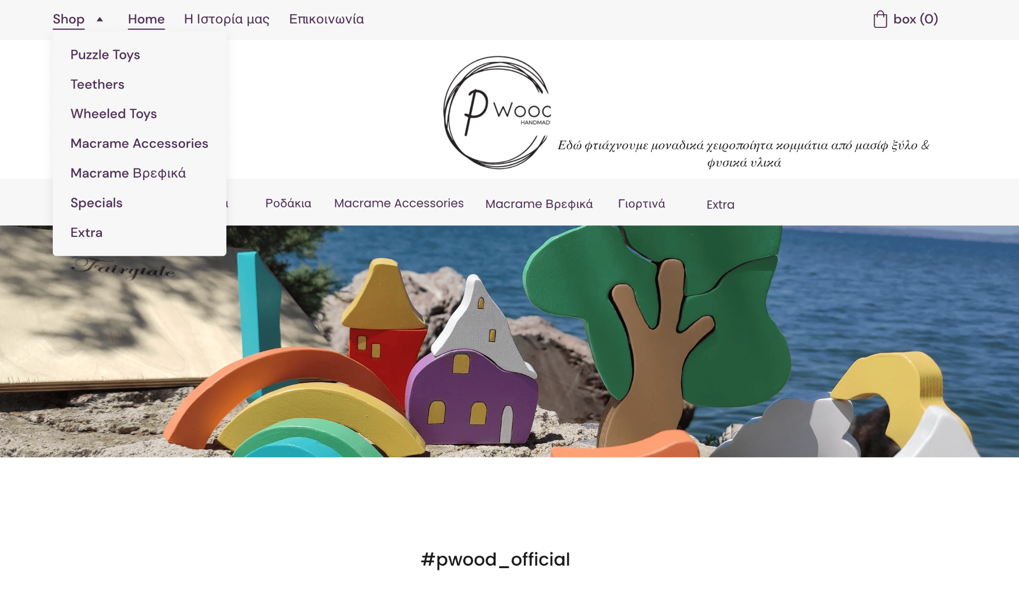
Pwood’s Homepage
This Grecian Macrame Shop’s website is minimalist and flawless, allowing the products to speak for themselves.
It’s easy to navigate and follows an intuitive layout. The Shop menu item in the navigation bar shows the product categories in English when you hover over it. But you can also filter the products by category (in Greek) using the navbar under the logo.
Tip: Give your visitors the option of filtering your products to speed up the shopping process.
4. Dahlia Designs
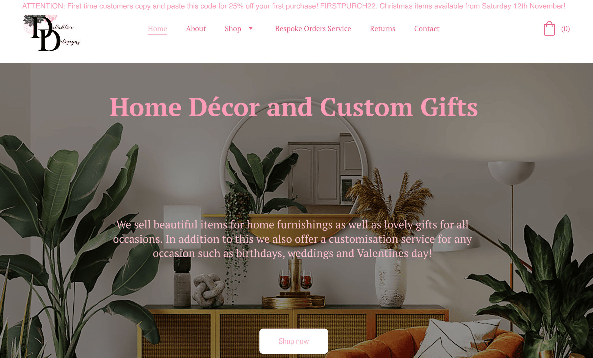
Dahlia Design’s Homepage
Dahlia Design’s website is as quaint as its décor and custom items, featuring pink fonts, cozy images, and charming favicon and logo. Above the nav bar and footer, Dahlia Design displays promotions and announcements using Hostinger Website Builder’s banner feature.
Customers can login to their personal account, purchase ready-made decor, and track their orders. For custom orders, you can visit the Bespoke Orders page and complete the form.
Tip: A customer login area is useful for managing loyalty programs and discount offers. Hostinger allows your guests to register via email using a quick sign-in link.
5. Fantasy Farms
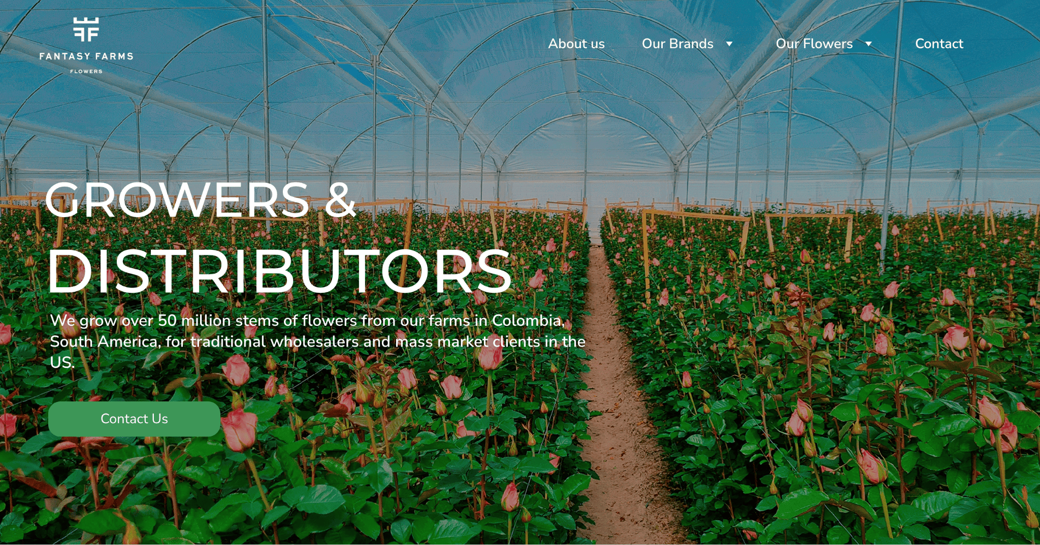
Fantasy Farms’ Homepage
Fantasy Farms chose Hostinger Website Builder to create a rich vertical layout on their homepage, and it bests demonstrates how the platform can be used to create a more formal-looking website.
Aside from the feature image overlaid with a compelling description and call to action, there are three other sections on the page: a business overview, online store links, and product categories. There’s a clean and homogenous design, using image blocks and black and white fonts.
Every page has a footer displaying the company’s main address and social media buttons.
Tip: When creating a long homepage–or any page, really–consider using a sticky menu to make navigation easier. See how Fantasy Farms achieves this with a fixed navigation bar at the top.
6. Serena
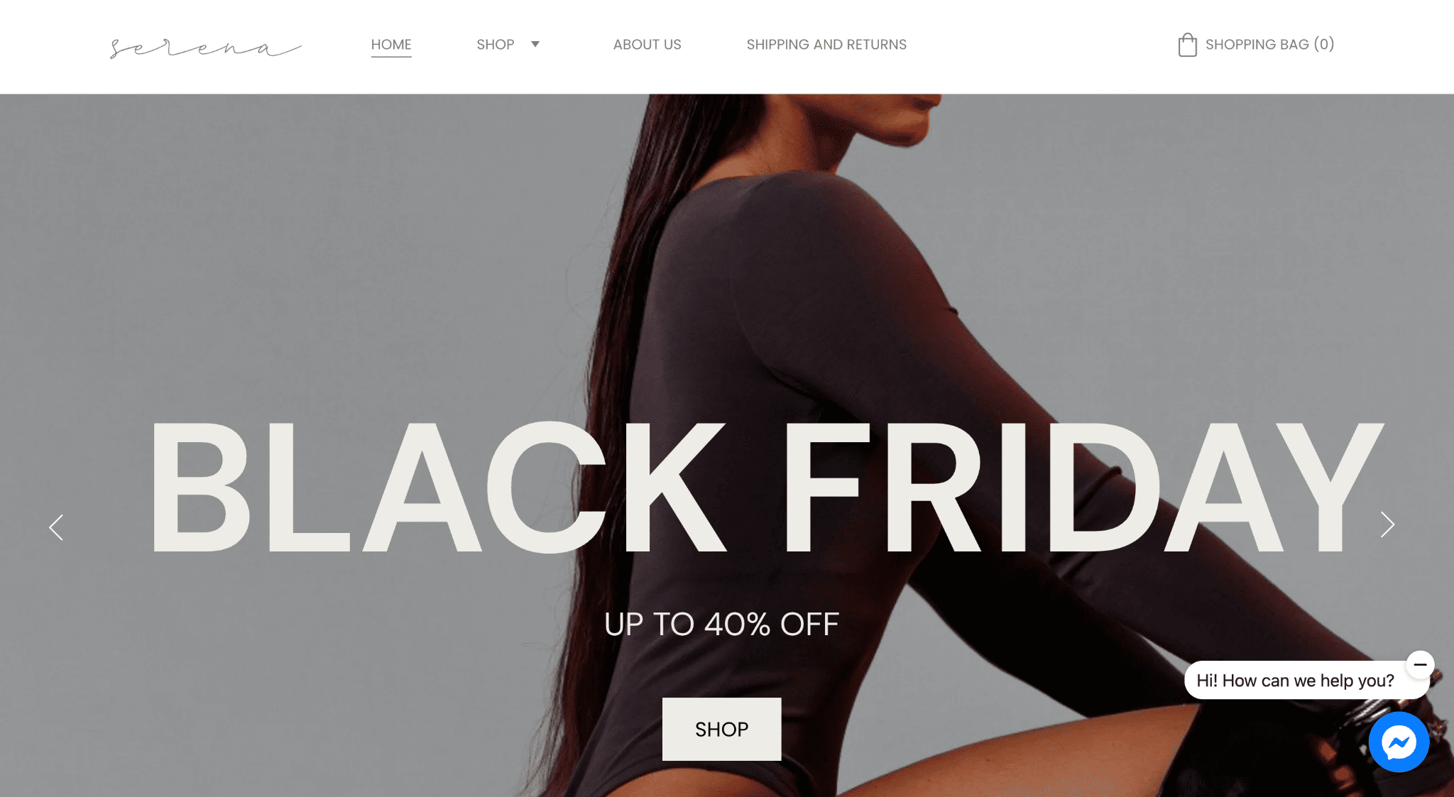
Serena’s Homepage
Fashion brand Serena makes a terrific move by using its Black Friday image as its website’s centerpiece during the Black Friday sales period. Its homepage also showcases the brand’s best-selling products and its carefully curated Instagram page.
Under Shop, shoppers can easily browse the brand’s different product categories, thanks to the dropdown menu. Serena simplifies its newsletter sign-up form by making it readily available on every page of its website: homepage, shop, about us, and shipping and returns.
Tip: Use a horizontal layout for your website’s newsletter signup forms. It increases visibility and enhances engagement.
7. Get Hands Dirty
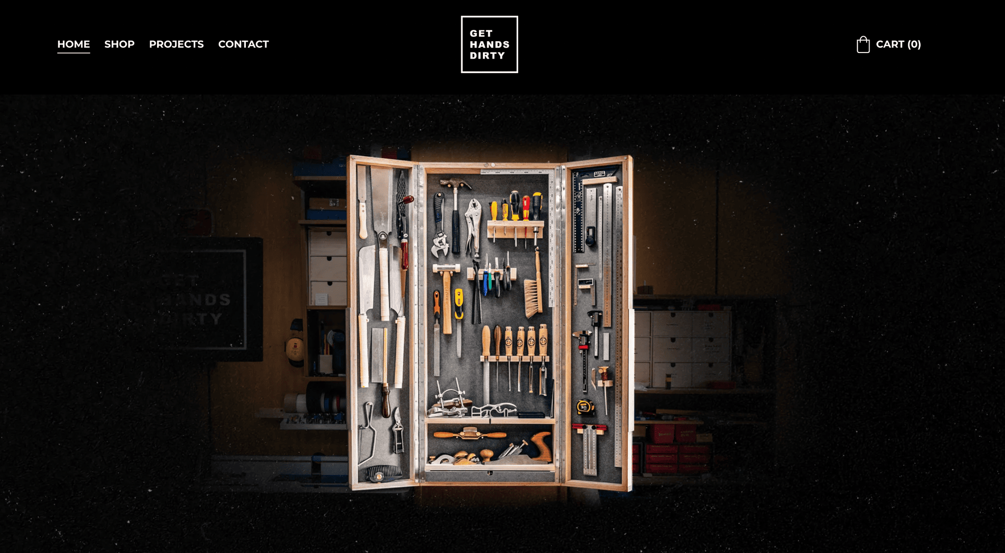
Get Hands Dirty’s Homepage
Cristiana Felgueiras runs a DIY YouTube channel with over 800,000 subscribers. The aesthetics and visuals on her website match those on her video-sharing platform.
Her Get Hands Dirty website houses all her creations–from tangible products to her prized videos. The Project tab displays a gallery of DIY YouTube videos accompanied by a list of tools she uses (with affiliate links!). You can find her creations in the Shop section of her website.
Tip: Websites are a good platform to promote affiliate links, enabling you to generate extra revenue. They last longer than social media posts.
8. Tati Uribe
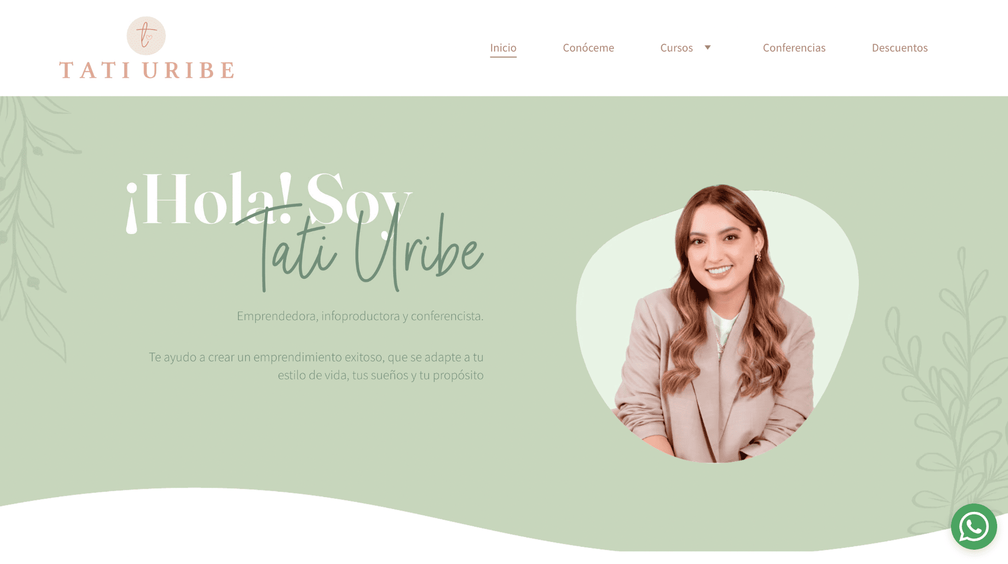
Tati Uribe’s Homepage
Tati is known for sharing helpful tips for entrepreneurs on YouTube (612,000 followers). The Colombian business mentor promotes her channel on her homepage with a video introduction.
Taking advantage of Hostinger’s easy-to-create pages, Tati also displays all her other offerings, such as courses, workshops, and affiliate discounts. She also makes sure her followers can reach out to her by adding a WhatsApp chat function.
Tip: WhatsApp Live Chat is a great way to stay in touch with your customers even when they leave your website.
9. Andrei Restrepo
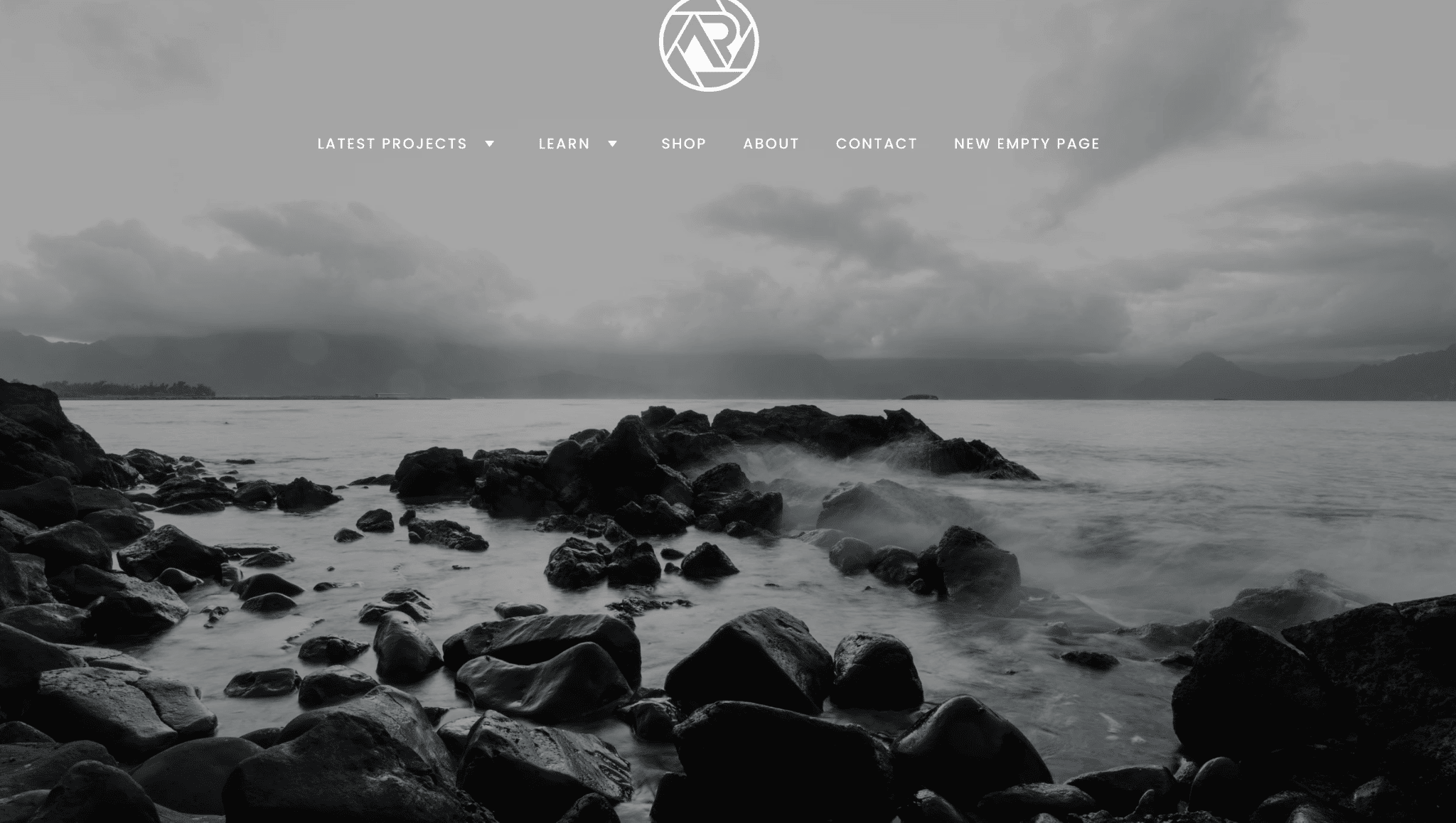
Andrei Restrepo’s Homepage
Photography expert Andrei showcases his talent by using a captivating landscape for a full screen image.
The homepage features a clean layout, highlighting his services, digital products, latest projects, and social media pages. Despite the varying color schemes, there’s a muted and mellow feel to the website.
Functionality-wise, Andrei provides an easy way for visitors to access his Etsy page by placing a “Shop” button in the main navigation bar.
Tip: For established Etsy sellers, linking your shop to your website can lend authority to your new website.
10. Jared McCormack
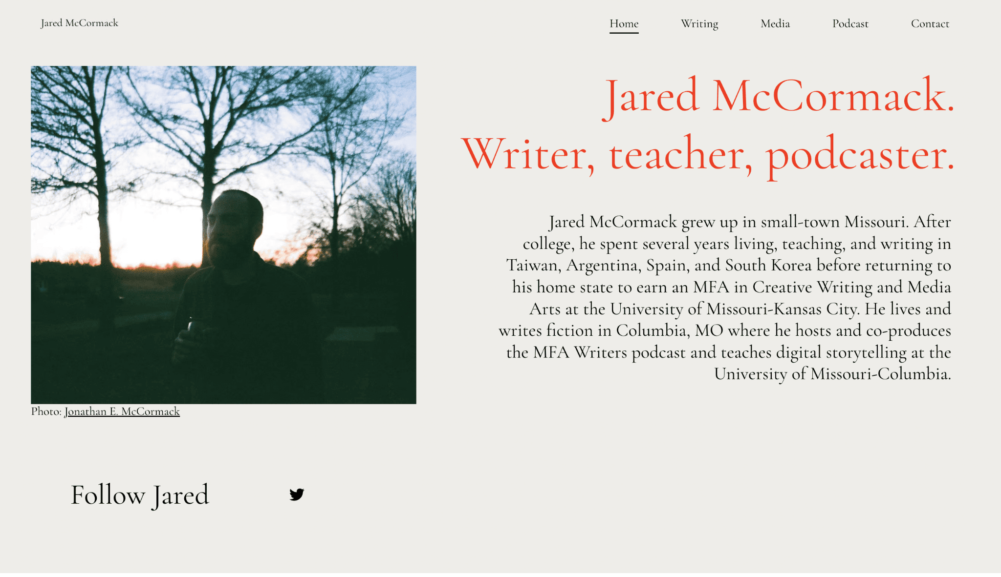
Jared McCormack’s Homepage
Writer and podcaster Jared McCormack’s homepage is straightforward. What you see in the image above, that’s all there is to it.
But when you head over to his “Podcast” page, it’s a goldmine. You’ll see an abundant column gallery of all his previous episodes. Clicking on an episode lands you on a page with a quick description and a link to listen to it on the platform of your choice.
Tip: Adding a Press Features page (shown as Media on Jared’s website) will score you credibility points with your audience and potential partners, whether you’re a freelancer, an ecommerce brand, or an influencer.
11. A Day Off
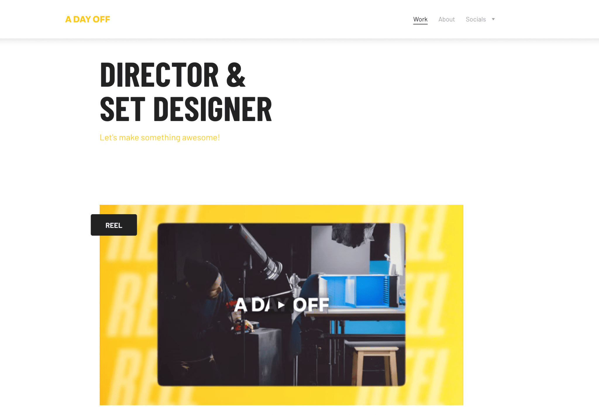
A Day Off’s Homepage
Jason van Domburh, the art director behind A Day Off, keeps his portfolio page simple yet powerful by featuring an introduction video on his homepage. There’s also a two-column gallery that showcases his latest work. To find the rest of his online presence, he places his social media links in a drop-down menu under Socials.
Tip: Turn off autoplay on your videos. You don’t want to startle your visitors with the audio or make them miss the beginning of the video. It can also seem intrusive to users viewing your site on mobile devices.
12. Monika Rimienė
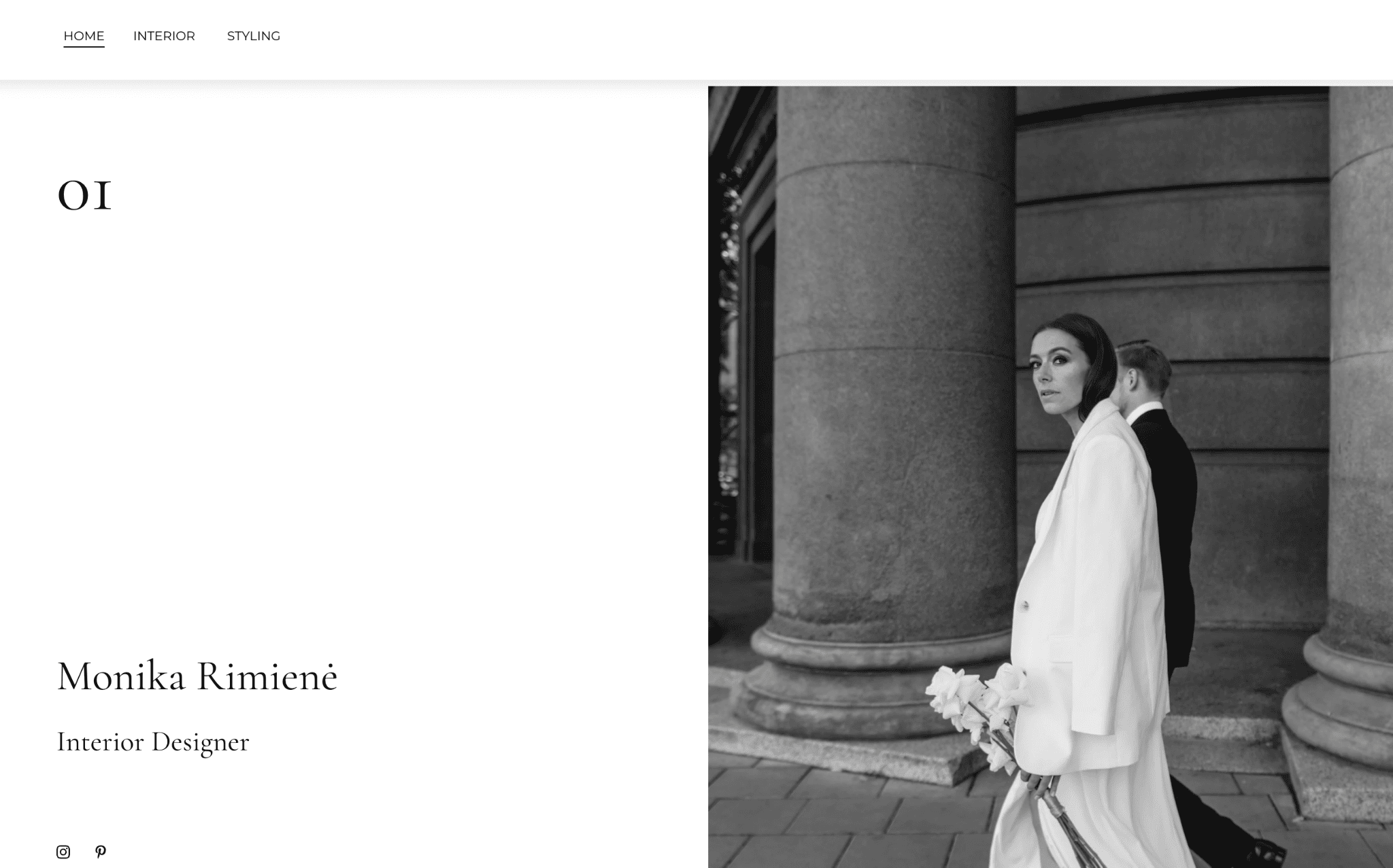
Monika Rimienė’s Homepage
Sophisticated. That’s one word to describe interior designer Monika’s website. She puts her aesthetic choices on display, making it easy to attract potential clients who echo her tastes.
Aside from the homepage, her website only has two other pages – Interior for her interior design projects and Styling for her product styling stints. On both pages, the images appear as blocks of varying sizes and are categorized per project–clean and pristine as her white dress in her feature image.
Tip: Choose your best work and let it take the spotlight on your portfolio site. Prioritize quality over quantity.
13. Stounson
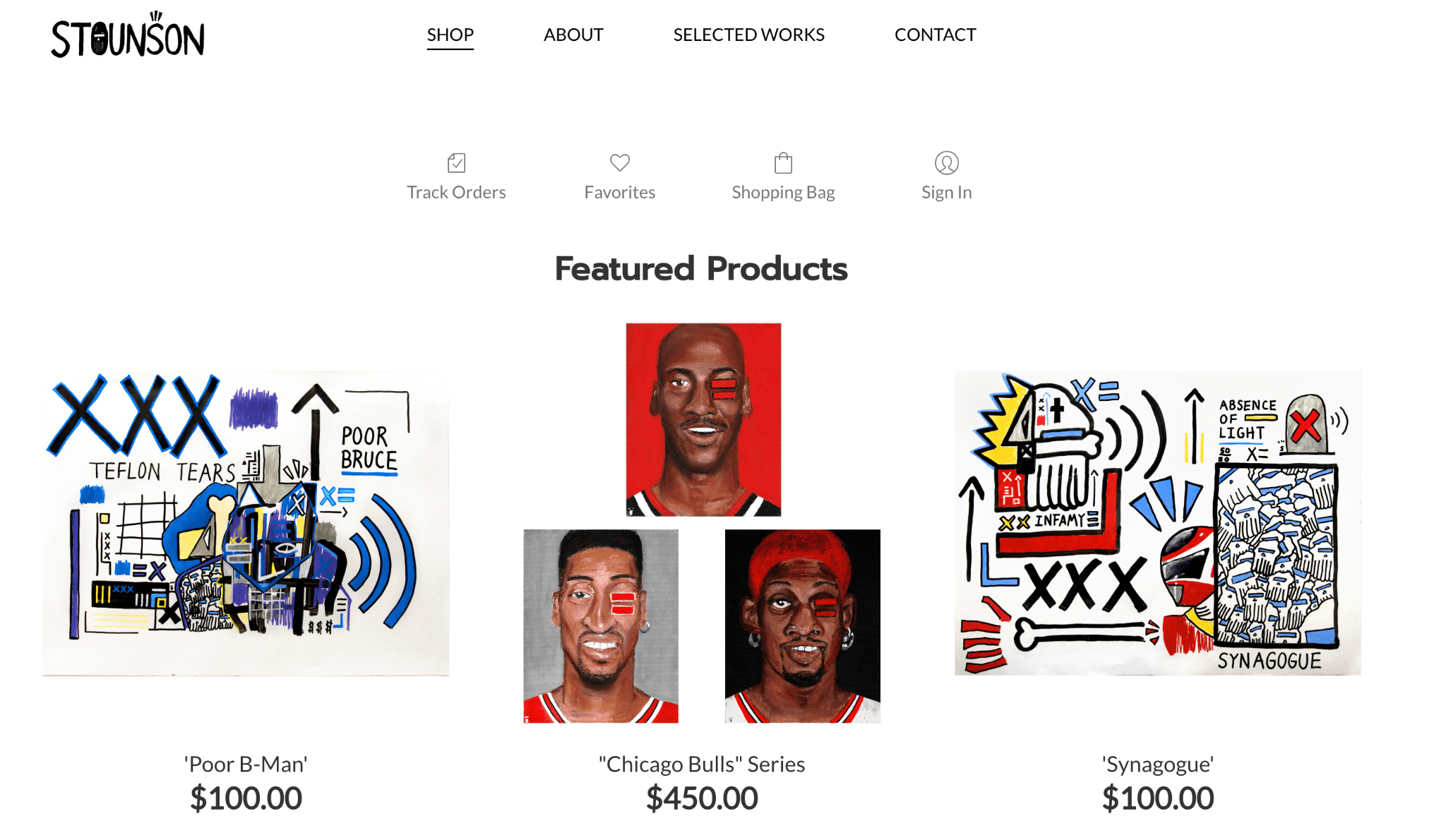
Stounson’s homepage
Nothing is more straight to the point than artist Stounson’s website. His homepage is his Shop, where he sells his impressive mixed pop art and neo-expressionist designs.
Stounson uses white space extensively on all his webpages, ensuring your eyes will naturally gravitate to the pictures, the star of the show.
Tip: White space is important to counterbalance colorful images.
14. Illuminated Goodies
Illuminated Goodies’ Homepage
Illuminated Goodies is run by a digital designer, and her work is the first thing you see when you visit her page. If you like what you see, simply click the “Contact Us” link. In fact, the designer ensures you don’t miss out by adding another call-to-action button (CTA) at the end of the homepage.
The portfolio contains a collection of images you can zoom into to study the details in greater detail. And that’s about it, really. Another straightforward design from Hostinger Website Builder.
Tip: Make the contact page easy to find. Aside from linking to them with CTA buttons, there should always be a spot on your navbar for this page.
15. I Am Rabbani
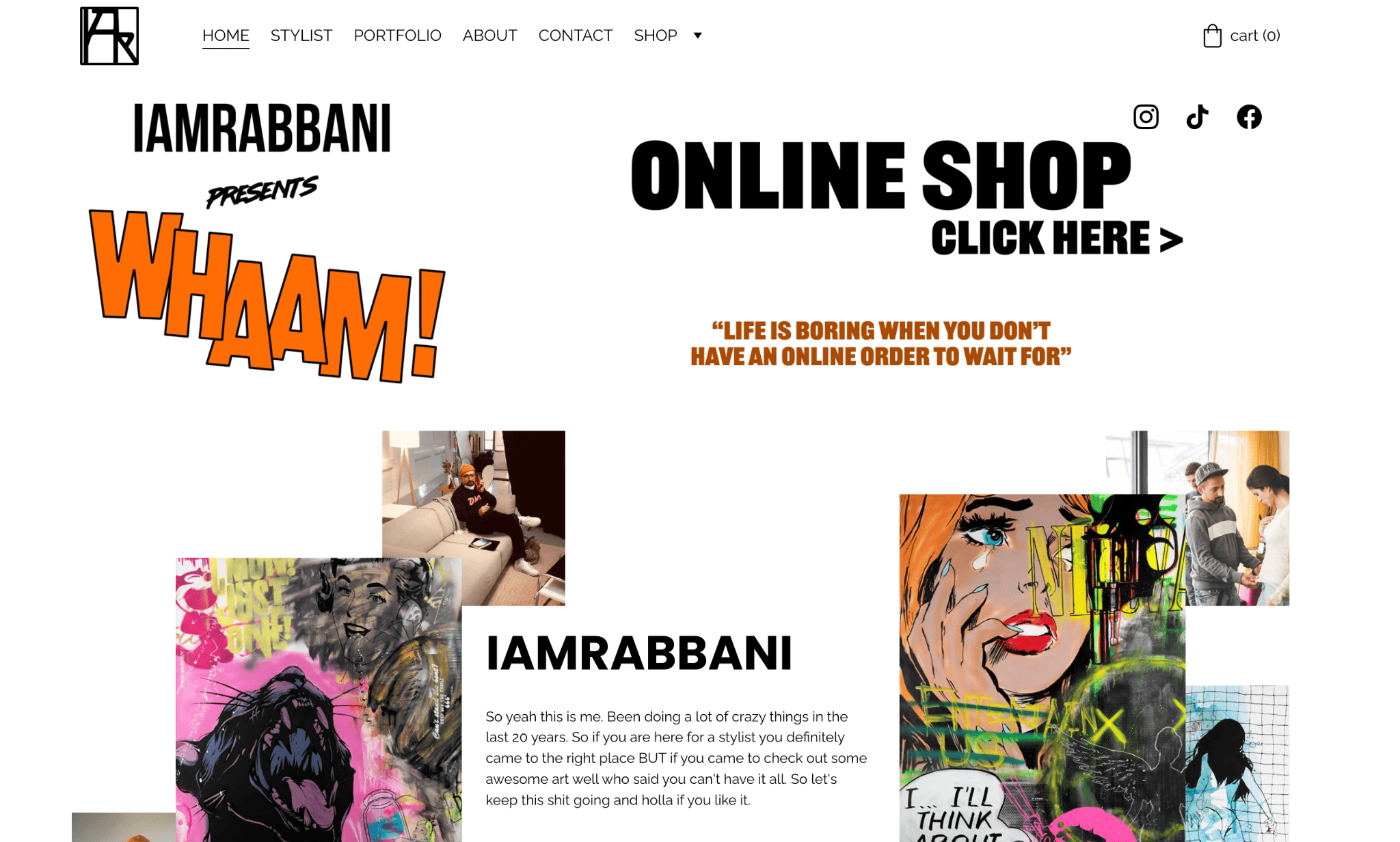
I Am Rabbani’s Homepage
From the get-go, you can tell Ali Rabbani, the person behind the website, is an interesting character. This portfolio-turned-online shop came out great with its unified eclecticism.
The fashion stylist and artist uses a collage of fun and vibrant images to surround the text in the featured image.
On top of that, there’s a banner that points you to the online shop. If you click anywhere on the image, you’ll be taken to the Shop page. Scroll past his homepage intro to see his greatest creations (also available in greater depth on the stylist and portfolio pages).
Tip: To maintain an eclectic look with a strong image focus, use neutral backgrounds and arrange the elements symmetrically.
16. Video Camp
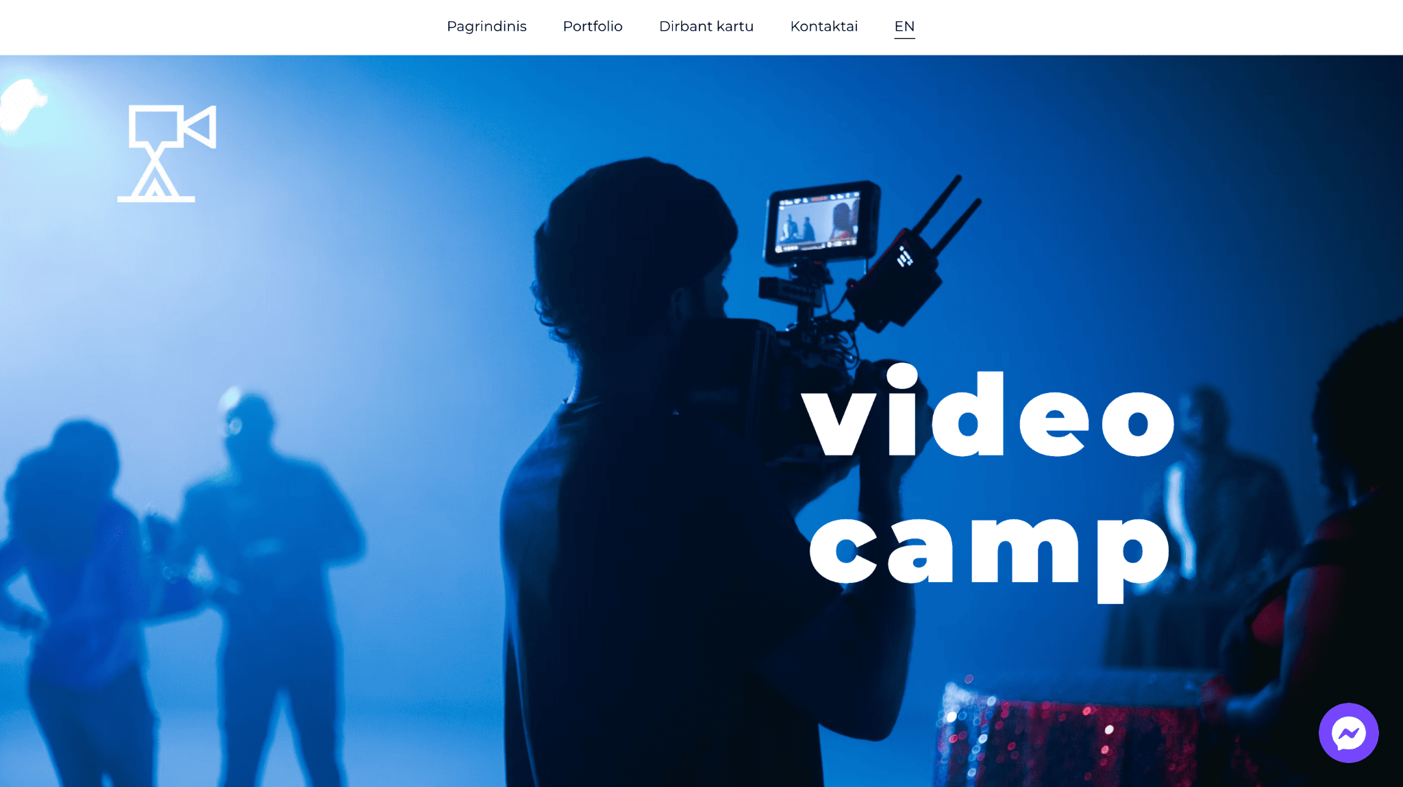
Video Camp’s Homepage
Cinematographer Vitalis Mika creates video content for brands. He uses full-screen images and videos on various pages of his website.
While his company Video Camp is based in Lithuania, he’s able to reach a broader audience by offering English language options on his website, thanks to Hostinger’s multilanguage function.
Tip: Make it easy to access the language switcher when creating multilingual websites.
17. Open Bar Ghetto Gourmet
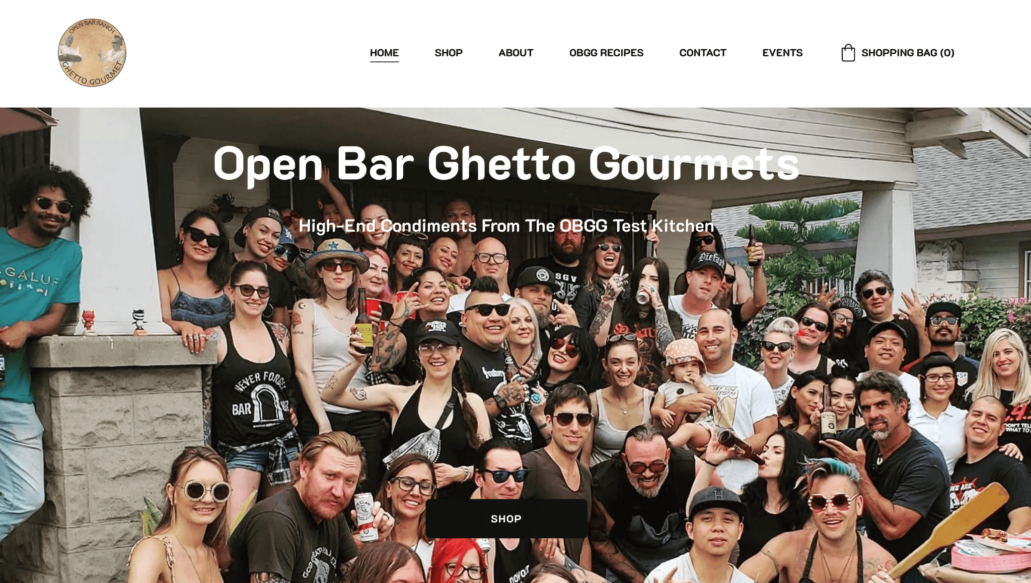
Open Bar Ghetto Gourmet’s Homepage
Open Bar Ghetto Gourmet offers condiments in mason jars that elevate homemade food to restaurant level.
Their website is simple, featuring only plain fonts and candid and casual photographs. This design choice is intentional and speaks volumes about the brand and its handmade, artificial-free products.
Aside from housing their best-selling jams, preserves, broths, and sauces in their Shop, the OBGG team also shares fantastic recipes on their website. The Events page offers details about upcoming opportunities to buy their goods in person.
Tip: Adding an events page to your website can be a great option for businesses that operate online. It’s useful for finding out about events like pop-ups, workshops, and celebrations.
18. Faisca Pizza
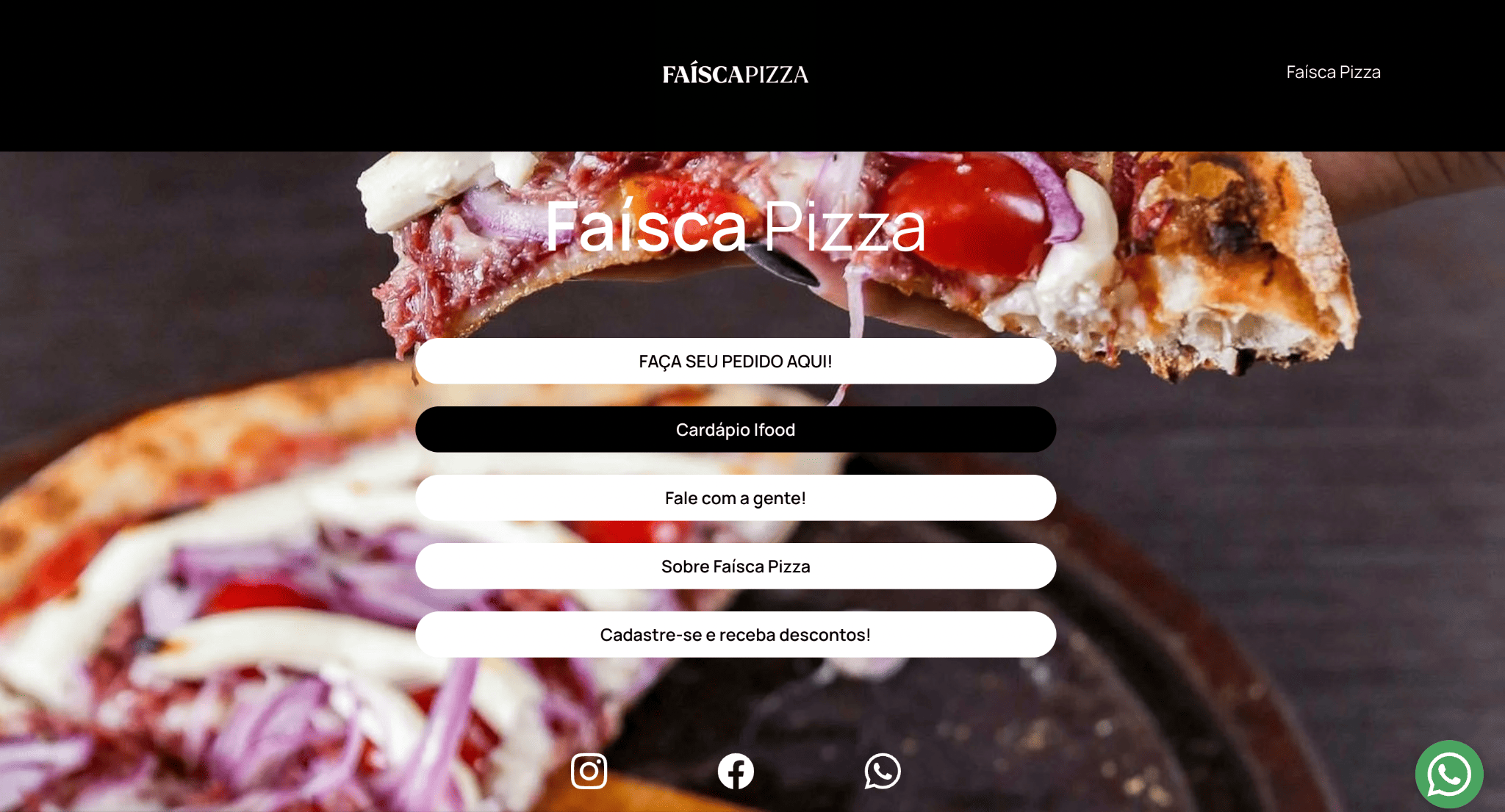
Faisca Pizza’s Homepage
Faisca in Portuguese means “spark,” so what better feature image to use than a striking shot of their pizza?
Instead of the traditional navigation menu, Faisca Pizza strategically places white CTA buttons across the feature image on their restaurant website. The first three buttons provide different ordering options: Yooga food delivery app, iFood delivery app, and WhatsApp.
The website has only two other pages besides the homepage. One About Us page and a registration form page customers can fill out to receive discounts.
Tip: Ensure your call-to-action is highly visible with a subtle animation. Faisca Pizza’s white button turns black when your cursor rests on it.
19. Abrahamic Food Corporation
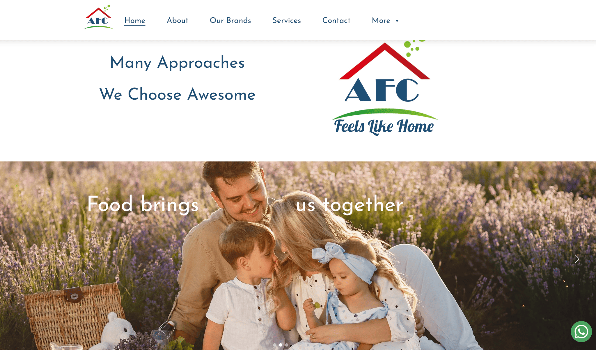
Abrahamic Food Corporation’s Homepage
Abrahamic Food Corporation demonstrates how Hostinger Website Builder can make impressive websites with multiple pages and a webbed structure, with most pages leading you to the contact page, instead of the homepage.
They have six main menu buttons, but a quick hover on “More” will reveal three more pages: Food Academy, AFC Community, and Online Shop.
From an aesthetic point of view, AFC did a great job embodying its brand values and philosophies on their website. Using a slider of family-friendly images, easy-to-read text, and small splashes of color, people are more likely to pay attention to their message.
Tip: Slider images are large files. Optimize them for a better user experience and a faster loading page.
20. Household Name
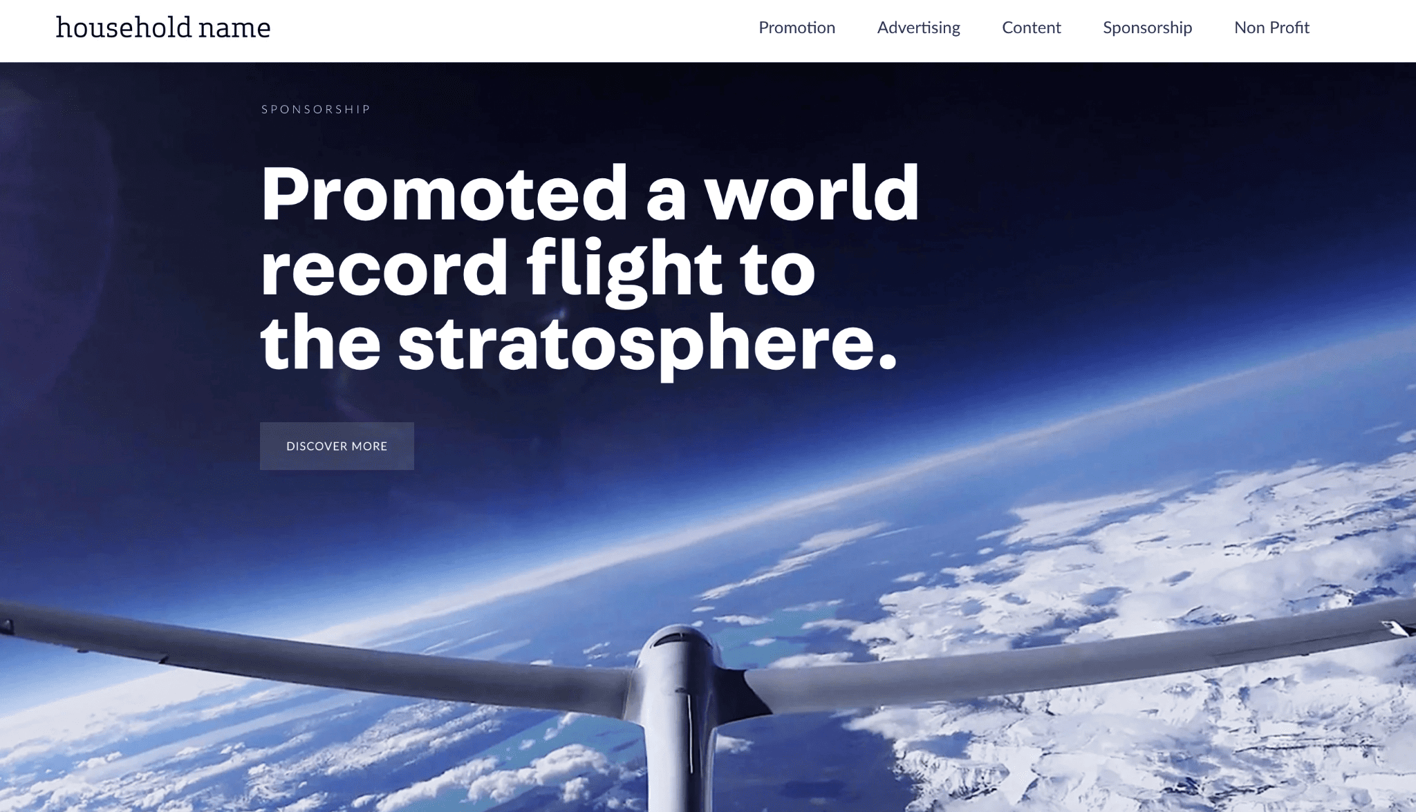
Household Name’s Homepage
Household Name, a brand promotion agency, uses its homepage as its primary portfolio. It features six blocks, which represent six projects. Each block features a full-screen image and a link to learn more.
The links direct you to project deep-dive videos, which are also accessible from their main menu under the following categories: promotion, advertising, content, sponsorship, and non-profit. On the footer, you’ll find links to social media accounts and other relevant pages.
Tip: Give your footer ample space, so readers will be able to read and interact with the buttons on there.
21. Datrick

Datrick’s Homepage
Datrick specializes in software engineering, setting up companies with remote developers. Their website uses a Parallax effect to make their homepage more dynamic. But overall, it adheres to a straightforward, business-like theme, with a prominent call-to-action button and a compelling tagline being the first things you see.
On the homepage, you’ll find informative content, engaging graphics, and thoughtfully-positioned CTAs. Other featured sections include client testimonials, workflow diagrams, and a sneak peek of blog posts.
Tip: Parallax is cool, but use it in moderation to add visual interest only where it’s needed.
22. Iskala
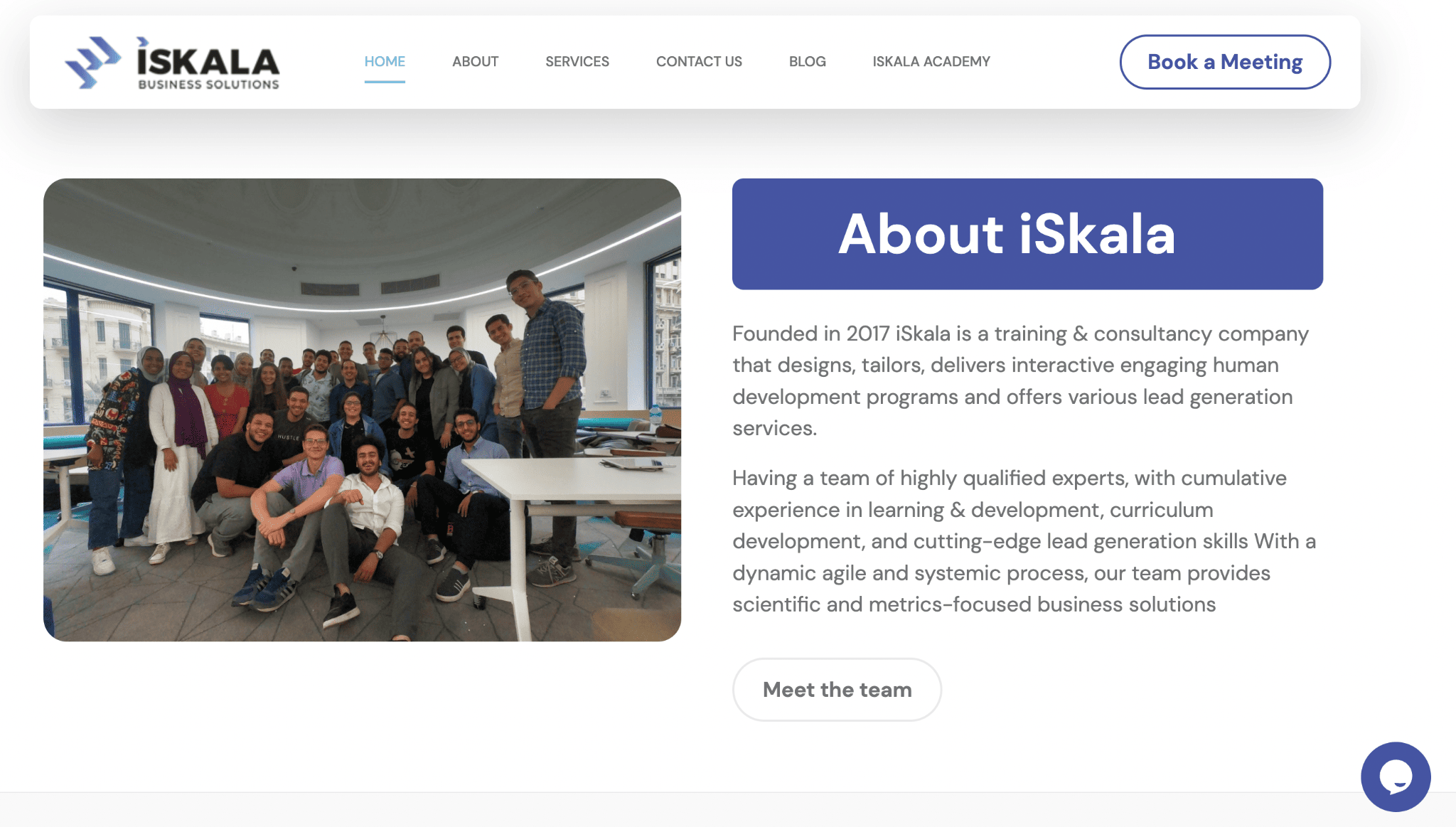
Iskala’s Homepage
An image of a smiling group of people in the office evokes confidence and trust. That’s exactly what L&D firm Iskala is after. In addition, they were clever to include performance statistics and a list of clients they serve, ticking off the social proof box.
They also added abundant CTAs and a chatbot, allowing for better communication and actionability. Since Iskala is a training and consulting company, there’s an online academy easily accessible from the navbar.
Tip: The homepage makes a good trophy case for displaying your client list. Unless you have case studies ready, refrain from putting your list on a separate page.
23. My Dream Malta
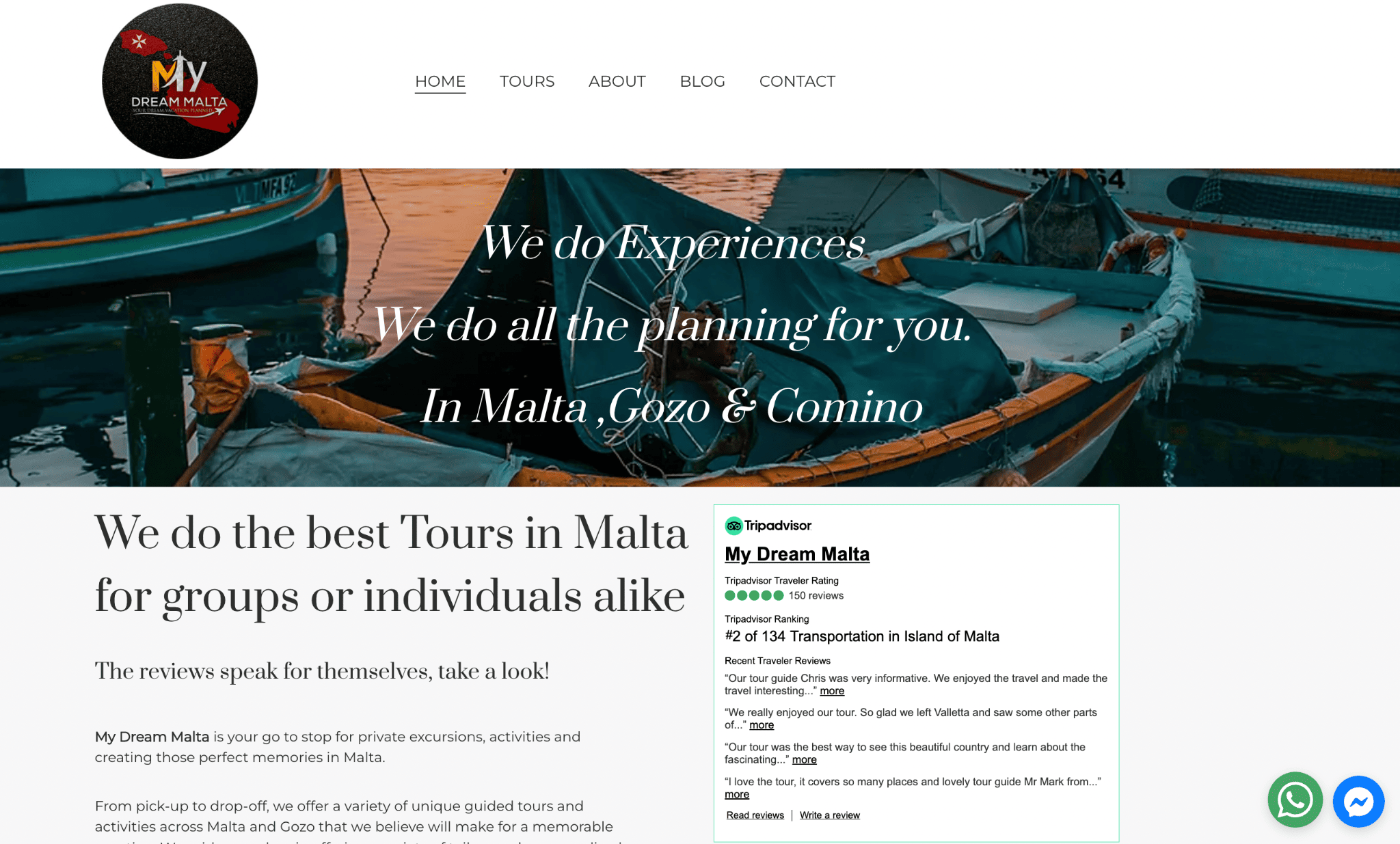
My Dream Malta’s Homepage
When you make travel reservations, do you research the travel company before booking? My Dream Malta makes this step a breeze by adding its TripAdvisor review page snippet (which is also a clickable image).
The Tours page features a gallery layout showing all their available packages. Click the image to check out a particular tour’s inclusions. Along with WhatsApp and Facebook chat buttons, there’s also a booking form and a contact page for instant correspondence.
Tip: Make your contact form easier to complete by including as few fields as possible.
24. Columbia River Gorge
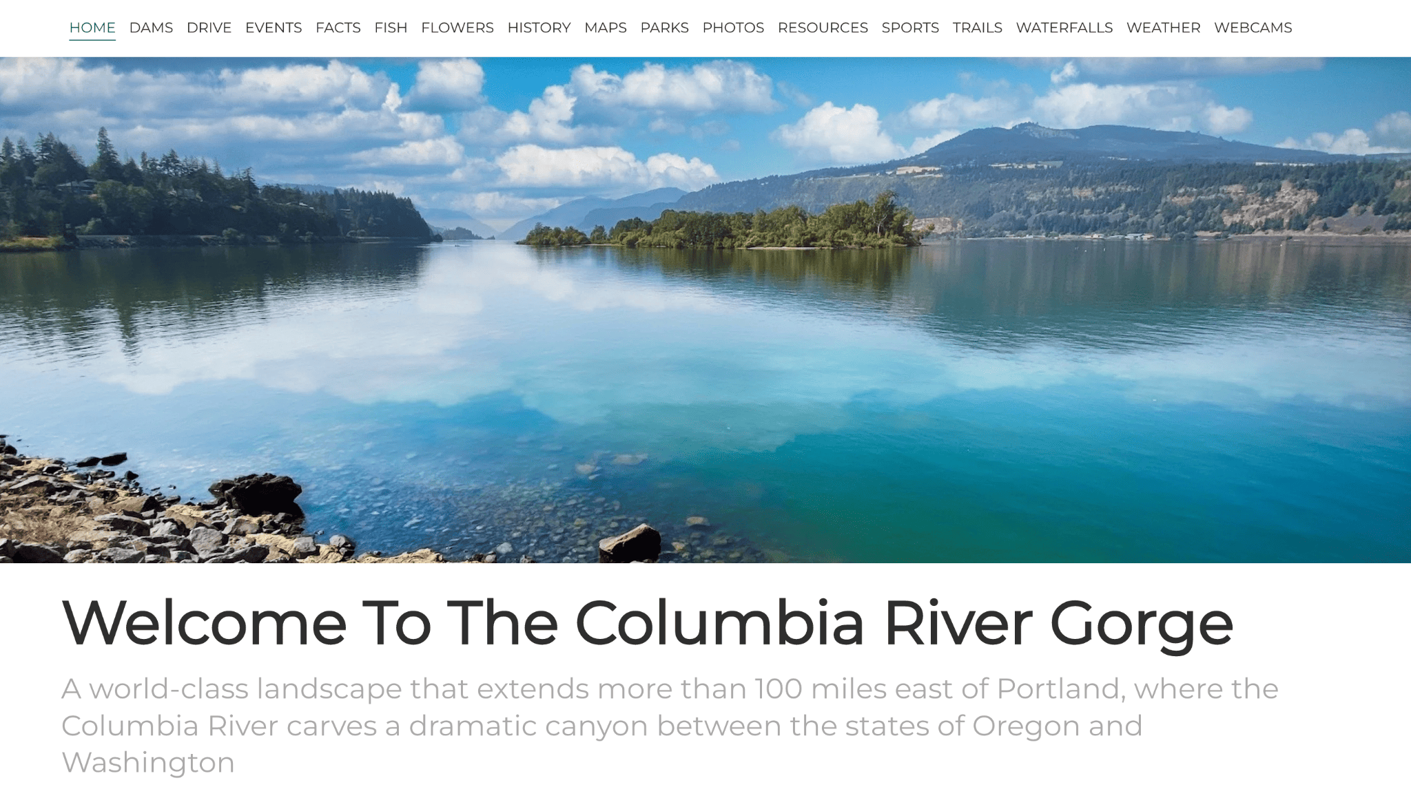
Columbia River Gorge’s Homepage
The Columbia River Gorge website isn’t one for aesthetics; this is an informative site about a national landmark, after all.
But it’s on the list because it shows how Hostinger Website Builder handles multiple pages and content-heavy websites. It has 17 navbar menu options, each leading to a page with long texts and images.
While there’s a case for simplifying these categories, or using subcategories to display less-important pages in a dropdown menu, there’s no denying that this site is packed with resources and information – something that Hostinger Website Builder can easily accommodate.
Tip: If you have a long text section, avoid using different typefaces. Stick to a maximum of three.
25. Piktas Keksas
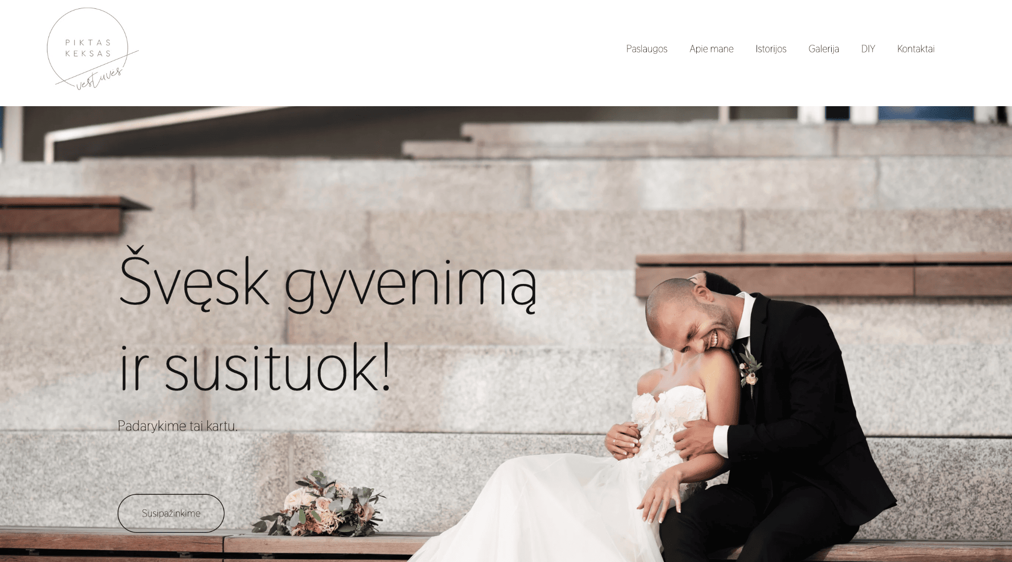
Piktas Keksas’ Homepage
Newlyweds laughing happily in a photo gives this website an immediate sense of joy. If you’re planning to tie the knot, you want a wedding planner who can make this your wedding day reality.
Since weddings are usually elegant affairs, Justina of Piktas Keksas (Angry Cupcake in English) incorporates classic professional photographs and clean typography all throughout her website. She also displays her Instagram feed on her page.
Justine offers free downloadable templates to her visitors on her DIY page. Guests are redirected to a Google Drive link when they click the download button.
Tip: Integrate your Instagram account into your portfolio website. It’s a simple hack to keep your page updated, and also packs a nice visual punch.
26. Tilly Rose Creative
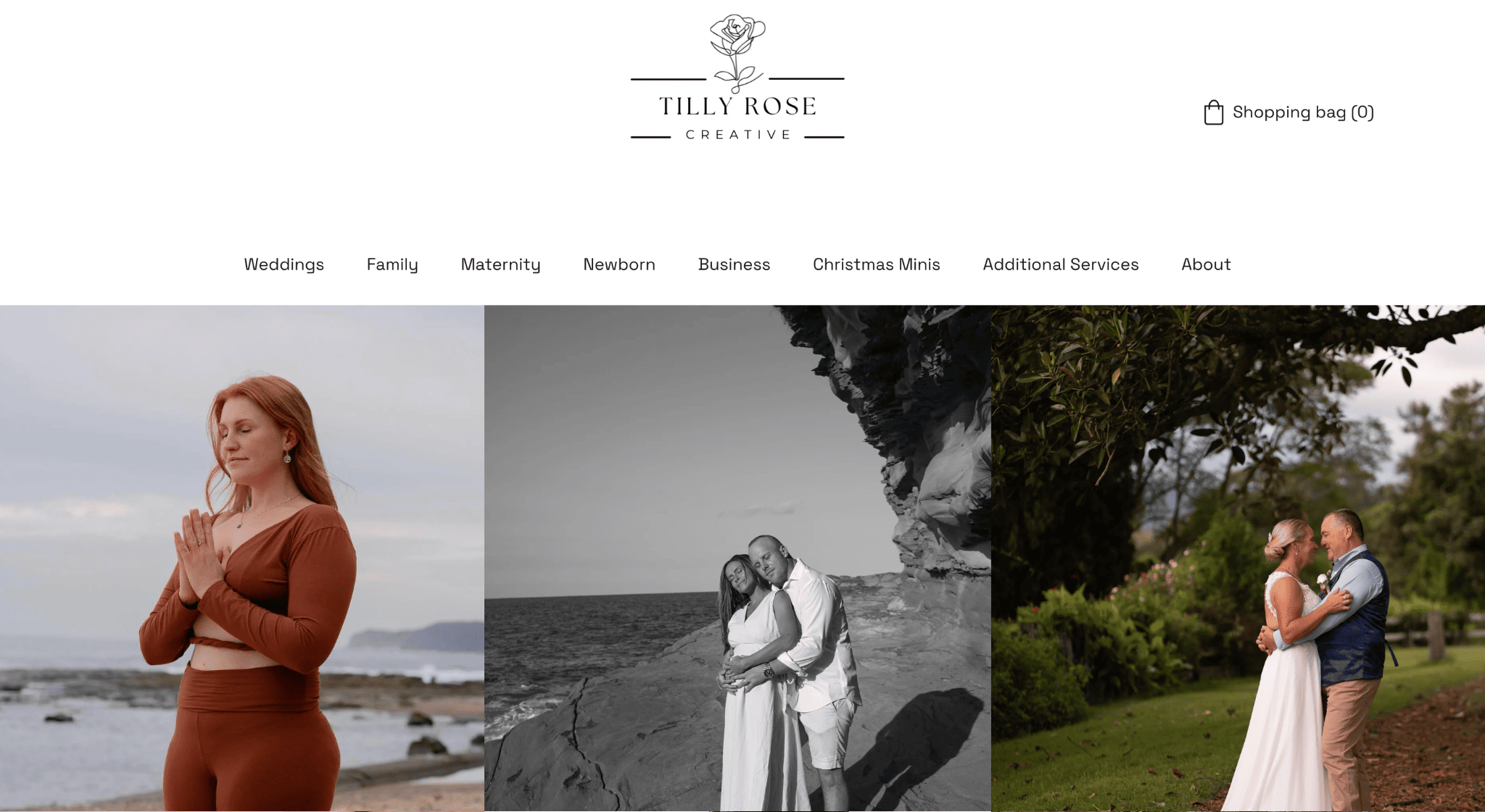
Tilly Rose Creative’s Homepage
Being a photographer, Tilly Rose’s homepage features a grid of her best shots. This photography website, as a whole, is packed with images. But the interface remains simple and intuitive, with the logo serving as the home button.
Her website offers appointment booking on each page. One page for every type of photography service available. She organizes these pages as categories on the main navigation bar. Getting hold of her is easy; simply fill out the contact form at the bottom of each page.
Tip: For heavy imagery, consistent style and size will make it more inviting and aesthetically pleasing.
Hostinger Website Builder Sites: Final Thoughts
Hostinger Website Builder still has plenty of room for improvement, but hey! It’s barely three years old. Still, its popularity is growing among people seeking an affordable way to establish an online presence.
In addition to its relatively low price, it offers a wide range of features suitable for any industry. Bottom line, this platform gives a great deal of bang for your buck.
> Try Hostinger Website Builder today
Do you have a Hostinger site you want to share on this page? Let us know in the comments below!
The authors
Learn more about us

We keep our content up to date
07 Feb 2023 - Zyro is now Hostinger Website Builder
THE BEHIND THE SCENES OF THIS BLOG
This article has been written and researched following a precise methodology.
Our methodology