Painters have their brushes. Sculptors have their clay. Web designers have their… fonts? As Oliver Richenstein has now famously written: “95% of the information on the web is written language.” After all the careful consideration you’ve given to your website’s custom graphics, icons, pretty menus, and clean interfaces, it would be a sin to then gloss over the vital component of web typography. It’s a crucial factor when designing your website, too.
Don’t worry—you don’t need to be a master designer in order to craft sleek and effective text. By adhering to some reliable guidelines and principles, your web typography will convey the information users crave in a manner that is easily readable and thoughtfully designed.
Establishing a Visual Hierarchy
The most important objective of good web typography is to create a hierarchy of content that visually flows from one element to the next. Proper distinction between your Headings, Subheadings and Body text, a variety of font weights and styles, and having enough white space between blocks of text are all factors that promote an effortless reading experience.
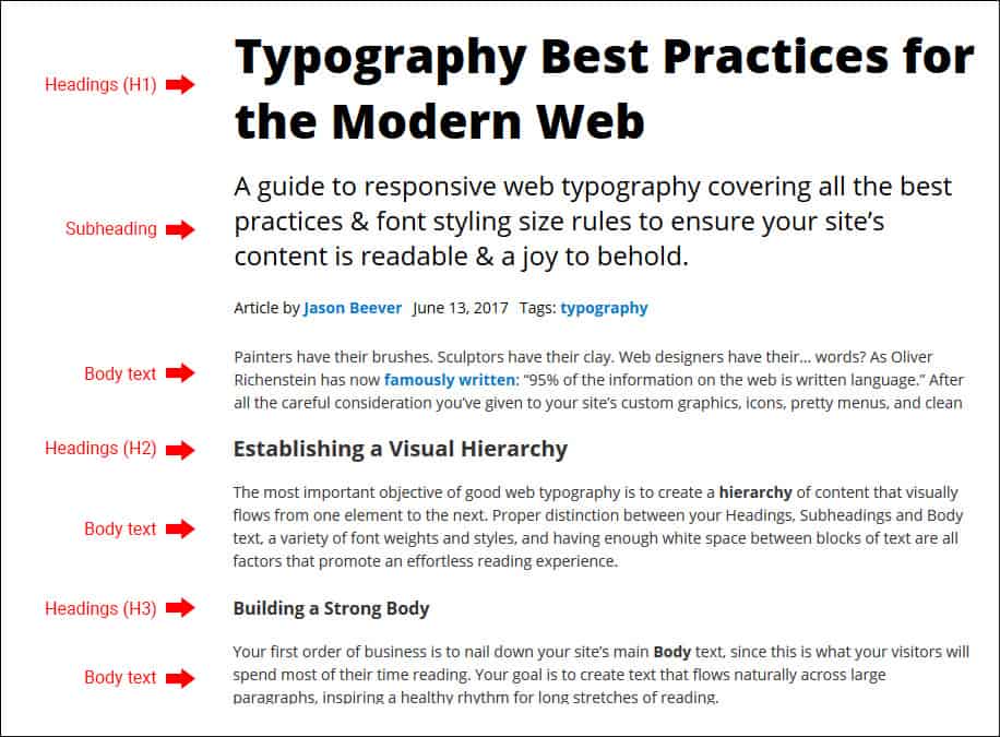
Building a Strong Body
Your first order of business is to nail down your site’s main Body text, since this is what your visitors will spend most of their time reading. Your goal is to create text that flows naturally across large paragraphs, inspiring a healthy rhythm for long stretches of reading.
- The most common font size for Body text is 16px—or, better yet, 1em (more on this later).
- Avoid center-aligning your text, as the uneven edges on both sides will make for an unappealing sight. Instead, set the left and right margin of the text’s container to auto to achieve a more desirable effect.
- Justified text works great for newspapers, not web pages. The nature of fluid layouts can create unpredictable gaps of spacing between words.
- Choose low-contrast fonts over high ones. Fonts like Didot work nicely for jumbo headlines or for large format printing, but its high contrast between thick and thin stroke lines make for difficult reading at small sizes on websites.
- Be mindful of legibility. In many sans-serif fonts the capital “I” and lowercase “l” letters look exactly the same, which can create unnecessary confusion.
- The optimal line-height of paragraph text is between 1.25–1.5× the font-size. Adjust accordingly based on your chosen typeface.
Headings For Success
For better or worse, most readers will likely skim through your page’s Headings without even bothering with the main text. Therefore, it is critical to grab their attention and urge further reading by ensuring that the typography of your headlines is remarkable.
- The average font size for Heading text is somewhere around 36px—or, better still, around 2.25em (we’re going to get to this).
- Attention should always go to the Heading before the Body. Make sure your Heading text isn’t overpowered by too thick a font weight in the Body.
- Ensure that your headlines meet readers’ expectations. Considerably larger text with ample spacing between its child paragraph signifies a change in subject matter, whereas smaller headlines much closer to paragraphs imply that the content is related.
- In the event that your headline should wrap to the next line, be aware that the optimal line-height for Headings is less than what it is for Body text.
The Space Between
The amount of space separating your page’s elements says a lot about their relationship with one another, and it is a design principle that cannot be overlooked. Dominant headers surrounded by an ocean of white provide a much different context than smaller headers attached closely to paragraphs (remember we’re building a visual hierarchy).
Generally, it’s better to err on the side of having too much white space than not enough. Clean layouts with generous white space are what’s preferred in the modern web.
Falling in Line
Imagine reading text on your high-resolution 27-inch monitor that stretches all the way across both edges of the screen. Your eyes would become fatigued after just one paragraph!
It’s important to keep each line of your main text limited to a certain number of characters so that the eyes remain focused on a central point. The popular consensus is that this magic measure for desktops is 60–75 characters long. For mobile screens, where we want to avoid squinting eyes and overly condensed text, this number sits around 35–40 characters per line.
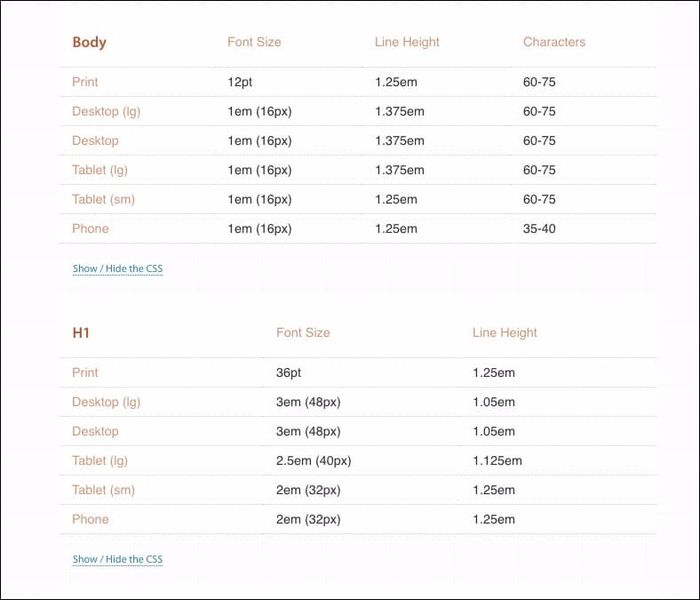
Tipping the Scale
Much has been written on the subject of scaling between Body and Heading font size. Just what is that perfect H2 size if your Body text is, say, 1em? Determining the most aesthetically pleasing proportions between Body text and H1–H6 headings is luckily something many typographers have already decoded. Additionally, these mathematical proportions must also adapt based on the user’s screen size.
Designer Jason Pamental provides a useful chart for what he believes are the most optimal font sizes across various media devices—and I tend to agree with him. Essentially, even though the ideal H1 size on a desktop may be 3× the Body size, on a mobile screen this will appear too exaggerated—so it must be scaled down to accommodate for the smaller viewing area.
QUICK NOTE: How can you tell if you have a good visual hierarchy? Squint at your screen until all the text becomes blurred. If the layout appears as an amorphous blob with no distinction between sections, then your hierarchy might be failing. If, however, you can easily discern separations between blocks of text, headlines, and clearly know where the eyes should travel, then you’re in great shape!
Keeping Text Responsive
Responsive web design is an essential practice these days—particularly as more and more people utilize mobile devices as their primary means to browse the Internet. While designing with percentages rather than pixels has revolutionized the way images and margins adapt to fluid widths, responsive web typography has unfortunately remained a tougher egg to crack.
Optimizing font sizes across multiple devices can become overwhelming as you must navigate through several media queries to target all of the text on your website. However, with a quick adjustment to your unit of choice, you’ll more easily discover the right font sizes to use for any type of screen.
Ems Over Pixels
To simplify your site’s typography, ditch the pixel and start using ems. Ems allow for an easier understanding of scaling between your site’s font sizes, and their smaller units are more manageable than the double-digit numbers of pixels.
More importantly, with ems everything is relative to the parent container. If you set the line-height of a container to 1.5em, then even if you were to change that container’s font-size, the line-height will remain at the correct proportion. With pixels, you would have to constantly adjust the container’s line-height property for every single change in its font-size to maintain visual consistency.
This principle holds true for margin, padding, letter-spacing, and most any other style you apply to your site’s text. No more tinkering with pixels on your content’s padding for every media query—just set its initial state in ems and it will automatically adjust with the original proportions!
Using Ems
The first thing to do is set the base reference of your site’s font size. In your style sheet, enter this:
body {

font-size: 100%;

}
This establishes a relative font-size of your site’s content to 1em, which most browsers interpret as 16px. Now all of your heading sizes— 2.25em, 1.5em, and so on—are direct multiples of the baseline 1em.
IMPORTANT NOTE: Ems are cascading—meaning their size is relative to the established value of its parent <div>. For instance: If you set your Body’s font-size to 1.25em and then a child container’s font-size to 1.25em, the two fonts will not be the same size! Rather, the child container’s text will be 1.25× the original 1.25em parent size.
More Tips For Great Web Typography
Here’s a few more tips for great web typography:
Don’t Overdo It
You should limit your website’s typography to 2–3 fonts at most. Typically this would be a font for your headings, a font for your main text, and perhaps a subheading font if needed. Using too many fonts can create a messy and unfocused layout. Your site’s loading time can also be affected, as explained by the next point.
Embed Only What You Need
Consider only what is most necessary for your site and leave the rest out. If you know you’re going to need regular, bold and italic styling for a given font, then embed only those choices and exclude the thin, light and black styles. Loading more styles than necessary can take a big hit on your site’s resources, as each individual style is a separate server request.
If you don’t want to limit your creativity during the design phase then go ahead and embed everything; just remember to remove the excess styles before your site goes live.
If You Can’t Read It, Don’t Use It
This one’s a biggie. While the flowery handwritten font may be tempting to use, if there is even the slightest confusion whether that’s a “g” or a “y”, then don’t use it! Nothing is more frustrating for a reader than struggling to decipher an illegible font.
Favor Real Text Over ‘Lorem Ipsum’
Every designer relies on lorem ipsum dummy text to fill empty content areas when planning a project’s layout. You may be surprised, however, just how much of an impact using the actual content can make on the look and feel of your typography. ‘Lorem ipsum’ is completely emotionless and intellectually hollow; it provides no real clue how your words and your personality will be expressed through typeface. Therefore, plug the actual content into your site as soon as possible before finalizing your site’s design.
Contrast with Backgrounds
A dark font against a plain white background will always provide the best readability. White text against a dark or blurred image is also becoming popular these days. Just be mindful that your background isn’t too intricate or detailed, which will overpower the foreground text.
An example of a bad typography practice using a “text over text” background.
Pairing Fonts – Like Attracts Like
Pairing fonts with completely different personalities will elicit confused signals. The two can be stylistically contrasting, but emotionally they should serve the same message.
Pairing Fonts – Keep it in the Family
The simplest solution is often the best. Sometimes the best pairings come from using variations (serif, alternate weight, slab) within the same Font-Family.
Hyperlinks
Common and expected practice is to underline links and remove the underline on hover events. When going this route, make sure that your emphasized text is italicized or bolded rather than underlined to avoid confusion.
These days, however, anchored text is generally colored instead, with a transitional effect applied when hovered. From a design perspective, this is undeniably the better option—but remember to keep it consistent!
Some CSS to Know
This affects the distance between letters. Useful for emphasizing headlines.
letter-spacing: x.xxem;This affects the distance between words:
word-spacing: x.xxem;This provides an alternative to all-caps for emphasis. Useful also for abbreviations.
font-variant: small-caps;This will CAPITALIZE ALL YOUR TEXT.
text-transform: uppercase;This will Capitalize The First Letter Of Text.
text-transform: capitalize;This will put a strikethrough over text.
text-decoration: line-through;This improves the display of fonts in modern browsers:
text-rendering: optimizeLegibilityUnderstanding Font File Types
It’s a good idea to embed multiple file types to ensure the fonts will load correctly in a wide range of browsers. These are the ones you should be most concerned with:
TrueType
TTF is the most common format for Mac and Windows, and it is supported in all major browsers.
OpenType
OTF is also widely supported, and it allows for add-ons like small caps and alternate characters without the need for embedding a separate font.
Embedded Open Type
EOT is only supported by Internet Explorer—and unless you’re worried about users on old versions of IE, it’s probably best just to leave this one out.
Web Open Font Format
WOFF—and its successor, WOFF2—are the new kings in town. Their support in major browsers and ability to be compressed make them the modern file type of choice.
Need to Convert a File Type?
You’ll likely run in to a situation where you only have one type of font file and need to somehow convert it to another. FontSquirrel and Font2Web offer online tools that will do just that.
Conclusion
You already knew that content is the single most important aspect of your website. Well-crafted content deserves well-crafted typography; don’t disappoint site visitors with text that is difficult to read or confusing in structure. With a carefully planned visual hierarchy that adheres to typographical best practices, your creative thoughts can also be creatively presented. Happy typing!
In case you have any more questions our you want to leave us some feedback, please drop us a comment below! 🙂
The authors
Learn more about us

THE BEHIND THE SCENES OF THIS BLOG
This article has been written and researched following a precise methodology.
Our methodology