Tooltester is supported by readers like yourself. We may earn an affiliate commission when you purchase through our links, which enables us to offer our research for free.
The world wide web as we know it today has come a long way. When the first websites were launched in 1991, they were nothing more than text on a plain background with some links.
Designing a website was nothing more than writing some text. A LOT has changed since then. Here’s a nice time machine project that gives you an idea of the story so far.
It’s quite impressive what you can do nowadays! Great, you think. You have all these ideas, but where to start? Let’s find out!
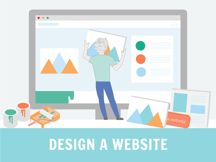
How should I start designing a website?
Our goal is to show you the easiest way to design a website. You can either start from scratch or use an existing design and adapt it:
1. Web design the hard way: Start from scratch
It’s not an easy job to get everything right! So, if you want to follow this route, you should check out tools like Sketch, Figma or Adobe XD. They are great for creating interactive prototypes. Tools like Photoshop or the classic pencil and paper can’t add any interactivity between pages or animations like scrolling, resizing or pop ups.
Also, keep in mind that none of the design tools mentioned are code editors. Once you’re done with the basic design, you’ll still need to code everything.
2. Web design the easy way: Start with an existing design
So, if you don’t have a super complicated project in mind, it’d be much easier to start with an existing theme. They exist for basically every type of standard website like blogs, portfolios, company websites, online stores, etc. Even for specific niches like dog sitters, dentists and real estate agencies.
Website builders always provide their own designs. Open-source solutions like WordPress come with a huge ecosystem of state-of-the-art designs made by industry professionals.
Check out the differences between a website builder and an open-source/ self-programmed solution in this table. Both have their pros and cons.
| Website Builder | Open-Source / Self-programmed |
|---|---|
| Designs are normally included. You don’t have to pay extra for them. | There are free designs but most professional designs cost extra. |
| No additional photo editing and animation software required. Many basic features are already included. | Photo editing and website animations will require further software or programming skills. |
| Since they are totally dependent on the website builder, they might have minor design limitations. | The perfect design is all that matters. Coding is your best friend! |
| Website builders are made easy for beginners. You won’t need professional help to change the design. | Time and dedication to learn new things isn’t an issue for you. |
| If you run into a problem, free support is available to help you with your questions. | You feel tech-savvy enough to handle design issues yourself. Alternatively, you can pay extra for support. |
| Wix, Squarespace, Shopify | WordPress, Joomla!, Magento |
Where to find inspiration for your website design
Most probably you’ll realize that a similar project already exists on the web. It could be a travel blog, online sunglasses store or a personal portfolio (find some portfolio examples here). Do some research on Google to find out what’s out there. Found something? Now think about what makes the website special? What’s good, what’s bad? You shouldn’t copy it pixel for pixel, nor reinvent the wheel. Just get inspired!
Perhaps you will find some old-fashioned looking websites with outdated content. Even better! That’s a great opportunity for you to make it better. No one likes outdated websites!
I personally find a lot of inspiration on websites like Dribbble, Behance and Awwwards. Talented people show off their work there. You will see the latest trends, interesting concepts and best practices there.
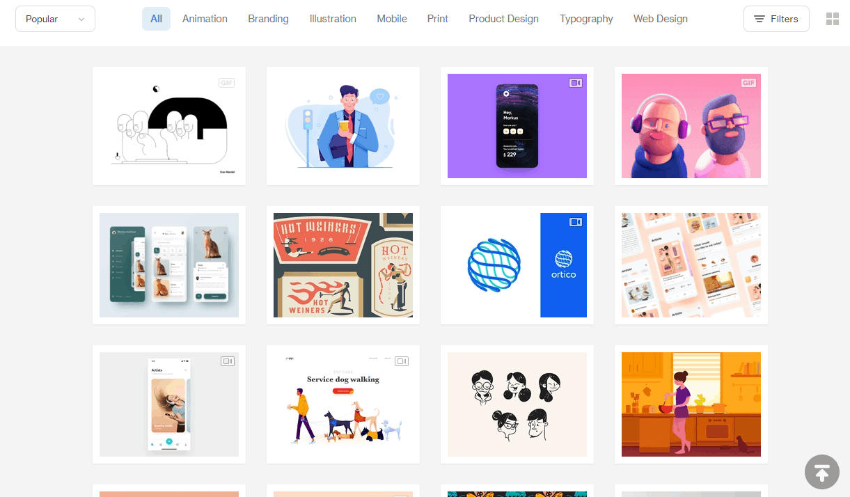
Find some inspiration on Dribbble
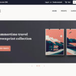
If you already know which website builder you are going to use, you should check out the existing designs they offer. Wix and Squarespace provide some excellent designs that you can edit on the fly. As you can imagine, for the world’s most popular CMS, WordPress, there also tons of free and paid themes available.
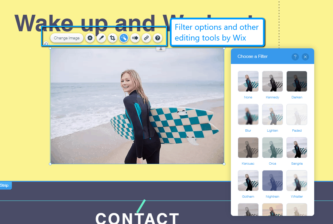
Wix’s photo editor provides filters, forms, animations…
Structure your idea
A typical beginner mistake is to pick a design, or worse, buy one, without knowing anything about its limitations. I mean, would you start building a house without a plan? Most probably not. We recommend you sit down and think seriously about your website’s requirements. Start with the basics and add more details step-by-step. These questions will help:
Which pages will you need?
Here are some typical examples: homepage, about, contact, blog, product pages, FAQ, landing page, etc. Another approach are single page websites. They combine several pages and arrange them in sections on one page. This can be great for user experience as you’ll need to click less. However, it’s only recommended if you don’t have a ton of information as you want to avoid endless scrolling.
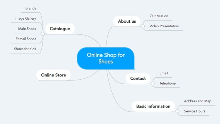
Create a mindmap
What do you want to show on these pages?
What’s the main purpose of the website? Which elements do you need (Call-to-action buttons, contact form, newsletter sign-up, ratings, testimonials, photo gallery, search bar, etc.?
What do you want to show in the navigation?
Structure your navigation well. Keep in mind that you can add sub-levels, but don’t go deeper than 3 levels. It would make your navigation too complex.

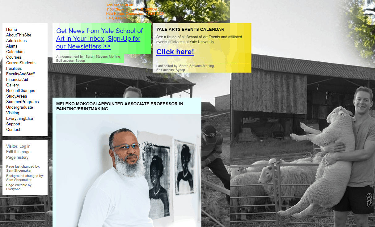
Bad navigation example
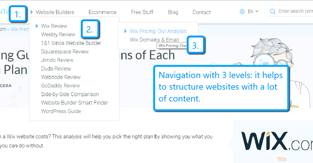
Structured navigation example
Once you have structured everything it’ll be a lot easier to pick the right platform and design. Most theme providers show a live version of the design on their website. Compare it with the requirements on your list. Does it have all the elements? If not, get in touch with the developer or try out their demo version. Sometimes it’s also possible to add new features with code injection.
Avoid these typical design mistakes! The 4 Cs
OK, I admit it. I thought it would look cooler if all 4 points started with the same letter. However, it’s also a good way to remember things. Somehow a good design decision, right? Here are the 4 Cs of design mistakes:
Complexity
Keep it simple! Believe me, this sounds easier than it is. A good design is not about being pretty. It solves a problem. Be honest with yourself: is it easy to navigate the website or is the navigation packed with too many links? Are there too many required fields in the sign-up form?
User-feedback is a great resource for improving things. Also, if available, use your website data. Tools like Google Analytics can help to understand user behavior. This can help to improve your content.
Consistency
Make sure you use the same color scheme, font-structure and style throughout the entire website. If you start to mix things, your website will look like some whacky patchwork quilt. In other words: it doesn’t look professional. A style guide can help here tremendously, especially when several people work on the same project.
Conciseness
One thing that I’ve seen, especially in personal projects, is too much text on the homepage. This isn’t the place to write in detail about your motivation or background. It should quickly help the user to understand what the website is about and what they can expect from it. Use keywords for your headlines to grab people’s attention when they’re scanning your website. Remember that if they don’t find the info they’re looking for quickly, they’ll look elsewhere.
Clearness
This point goes hand in hand with complexity: less is more, at least most of the time. Complexity described somehow the difficulty, whereas clearness should help more to distinguish a design. The content shouldn’t be cramped. Give it enough white space to breathe. This makes it easier to browse your website.
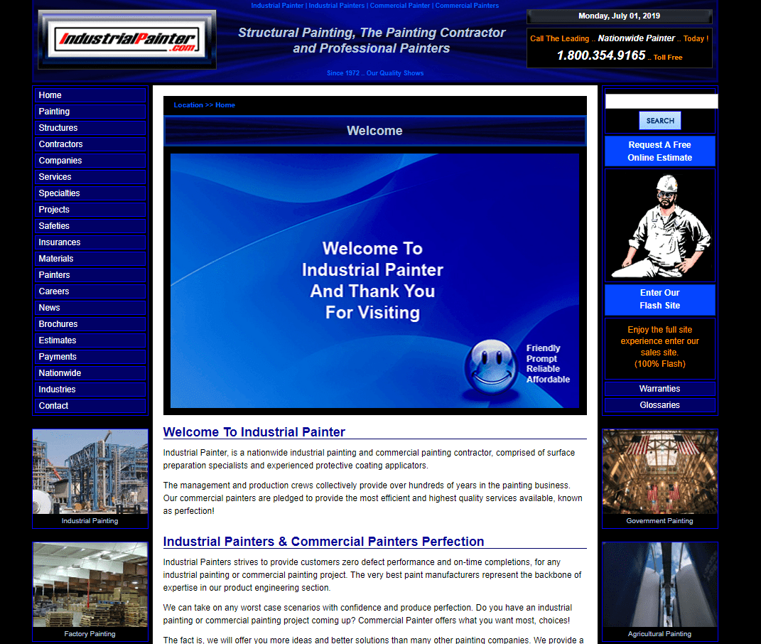
3 poor web design examples: Always keep the 4 Cs in mind!
Some thoughts about colors, fonts, and images
Even though we said in the beginning that web design is more than choosing beautiful colors, fonts, and photos, they are still crucial for every website. In fact, they can make or break your design. A good rule of thumb: less is more! This means you shouldn’t use too many different colors, typefaces, or images. This can make your website look very chaotic, overloaded, and make it run slower. Here are just some very basic tips without going too deep:
Colors
Obviously the colors should match your company brand, product, or industry. For instance, most people will associate red with love or blue with water and not the other way around. Of course, you can use red for water and blue for love, but I wouldn’t recommend it unless you don’t promote holidays at the Red Sea.
Once you have a primary color, you can use tools like the color wheel to find further matching colors. It even allows you to upload a photo to create a color palette out of it.
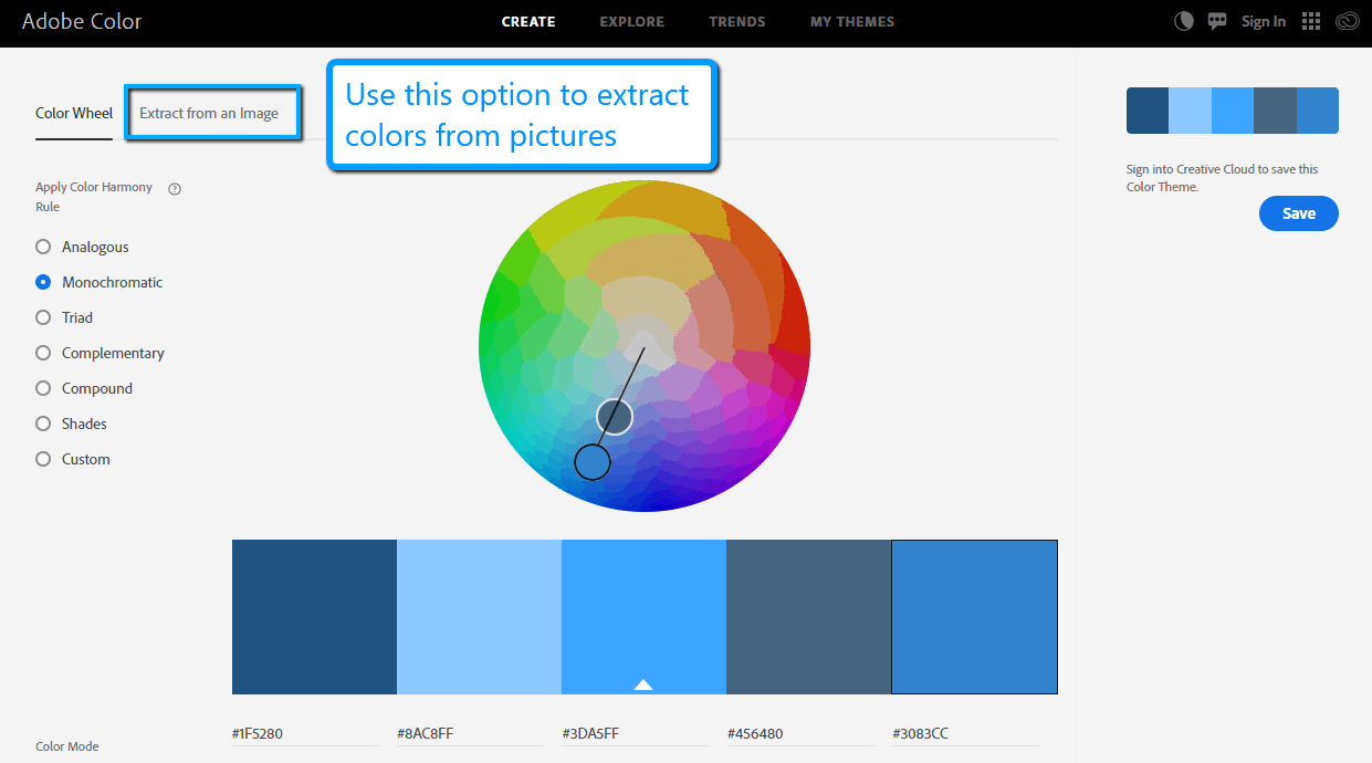
Adobe’s Color Wheel
One thing that I’ve seen quite a lot from beginners is the problem with contrast. When you pick your colors, make sure that there is always enough contrast between your fonts, background and pictures. It’s important for accessibility and much easier to read.
Fonts
Normally, two fonts are absolutely enough. Use them for headlines and text. You can modify the look drastically just by varying the same font as italic, bold, thin, etc.. Try to pick font families that match well.
The classic example of a bad font-type choice is “Comic Sans”. As the name says, it was created for comics, not for lawyers, doctors, coaches, or restaurants. The wrong font will make your website look unprofessional.

Imagine serious topics in Comic-Sans. The White House website would look like this. Odd, right?
Most designs already come with perfectly matching font families. However, if you desire more individuality, you should check out tools like FontPair or Fontjoy. They show how the fonts pair together using real examples.
Images
The most important rule: don’t use cheap looking stock photos. They will make your website look – you guessed it – cheap. Don’t get me wrong, there are great sources for stock photos, but don’t pick the ones that people already used 5 years ago.
If you can, use your own images (provided they are of good quality). I know this can be hard, but it gives your website an individual touch that can’t be found anywhere else. Images can influence content marketing too, for example, increase the reader’s engagement.
Again, if you want to lay some text over your pictures, make sure that there’s enough contrast.
Technical advice: Keep in mind that overloading you site with pictures can decrease your website speed drastically – especially when they are not optimized. Therefore, before you upload a picture, make sure it’s not too big. Tools like TinyPNG can help here. They will strip down your pictures without seeing a visible loss in quality.
Videos
Videos are becoming an ever-more prominent feature in web design. One of the latest trends are video backgrounds. This can work especially well on huge screens but remember that, like heavy images, a video will slow down your website because of its data size. Therefore, before you decide to add one at the top of your page, consider whether it’s really a necessity. A longer loading time can result in a higher bounce rate.
This brings us to our next point: test your design!
Test your design
What looks good on your desktop screen might not work on your mobile phone. Today’s rule of thumb is mobile-first! This means your mobile design is the foundation for higher screen resolutions.
It makes sense because mobile traffic is increasing and becoming more important than desktop traffic. Also, mobile connections are often pretty slow. Therefore you want to make sure that your website is mobile-friendly and ideally even mobile-responsive.
Another aspect of testing a design is A/B testing. The theory behind it is easy. Create two layouts and compare them against each other. Which one performs better? Unfortunately, this is more complicated than you might think. Typical reasons are:
- Complicated integration
- Not enough traffic for meaningful data
- Methodological errors (not enough time, too many objects, wrong hypothesis, etc.)
- Extra costs through dedicated tools
However, the benefits might be worth the effort:
- Better rankings in Google
- Lower bounce rates
- More signups
- Better usability of the website
- Faster page loading speed
Testing a design is an ongoing process. If you think this is too much effort, try to stick to proven best practices (such as the ones detailed in our guide on improving website design). Use elements the way they should work and place them where you would expect them. For instance, typically, the main navigation is at the top and not in the bottom right corner. Buy buttons are prominent and not a simple text link on a product page. I guess you get the picture.
Above the fold
One last crucial part of website design that I want to mention is the fold. It’s the very first screen that visitors see when they open a new page. What does this mean? Use it the best way you can! Be precise about the purpose of the page.
A typical example is your homepage: use a clear headline, picture/video and Call-to-Action button. Let visitors know what’s going on without even scrolling or touching the screen! Unfortunately, this can be tricky due to different screen sizes. It doesn’t have to be pixel-perfect, but crucial info shouldn’t be hidden.
The important info is above the fold.
And how much does designing a website cost?
Again, it depends on which route you choose to take. Starting from scratch is more expensive and time-consuming than a ready-to-go theme. We’ve outlined the costs for a few typical website projects here.
Also, even though a lot of people claim that WordPress is very easy, I can assure you it’s not. At least, when you compare it to a website builder. Their overhauled editor, Gutenberg, makes it easier to structure content, but designing the website is still quite an adventure.
A much more beginner-friendly solution are website builders like Wix and Squarespace. Their free version doesn’t have any design restrictions, though you might need to upgrade to a paid plan in order to publish your site.
Keep in mind that all solutions have their limitations, so it’s always a good idea to sit down and take some notes before you start designing your dream website. Think about the structure and content and how it should work.
TL;DR – How to design a website again?
Congratulations if you have made it this far. I know this was a lot to take in about website design – though I’ve really only just scratched the surface. These five steps summarize the basic process behind a typical web design project:
- Get some inspiration.
- Structure your website idea.
- Start designing your website.
- Check the design for typical issues.
- Go live with your website.
Website Design Examples
Last but not least we want to show you some nice looking and modern examples. Just a little bit of inspiration!
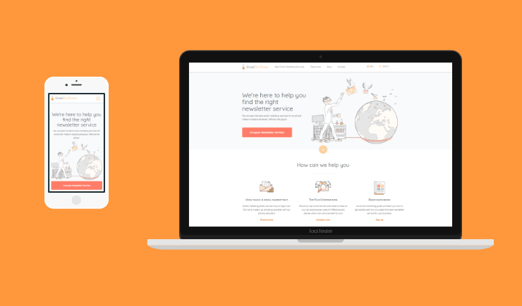
Wix
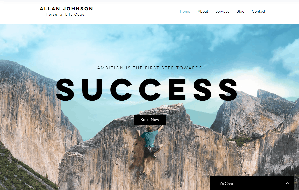
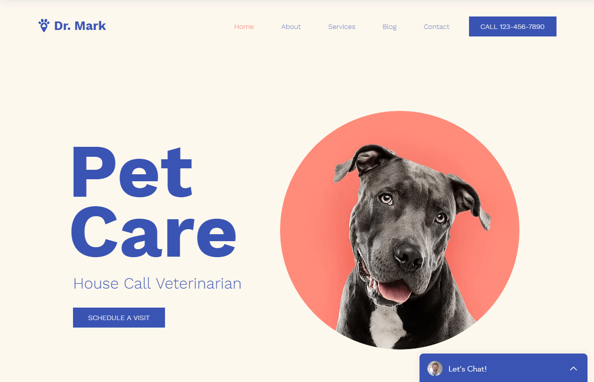
Find more Wix themes here and see some live Wix website examples here.
Squarespace

Find more Squarespace themes here and see some live Squarespace website examples here.
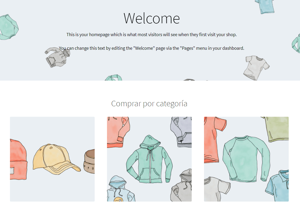
Shopify

Find more Shopify themes.
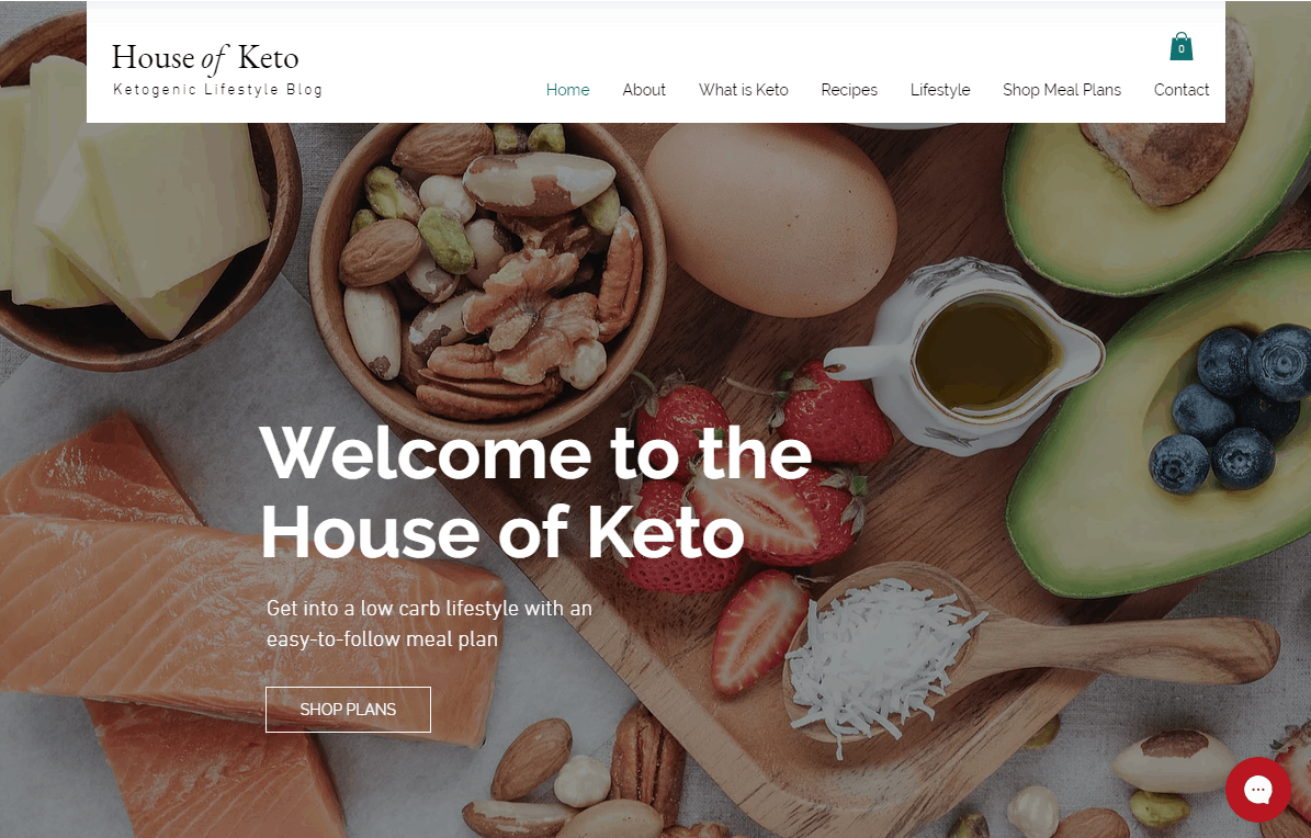
WordPress
I hope this design guide helps you get a basic idea of website design. Maybe you also want to check out the story of our Tooltester redesign project (which took us nearly 1.5 years!).
Let us know what you think. I’m looking forward to hearing your feedback!
The author
Learn more about us
THE BEHIND THE SCENES OF THIS BLOG
This article has been written and researched following a precise methodology.
Our methodology