Tooltester is supported by readers like yourself. We may earn an affiliate commission when you purchase through our links, which enables us to offer our research for free.
Obviously, your website should be modern and appealing, and it should inspire your visitors by using an elegant design. But be careful: Don’t just chase trend after trend! After all, conventions that die-hard are not necessarily conventions worth their while…
To keep your website clear of the little things in design and usability that often seem a bit strange to your visitors, we have taken a look around and made a list of the most annoying web design trends currently in use.
Preloaders
You click on a page, you get all excited about the information you’re about to discover, and your reward is a little spinning wheel. Or maybe a loading bar, little jumping dots, or some other thing that painfully reminds you of the good old days of flash-based websites: Loading… And it happens after every single click, too.
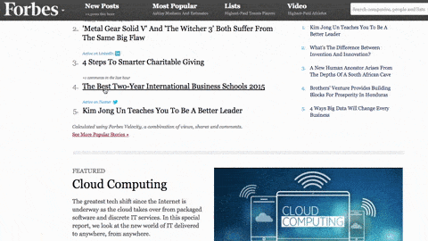
Source: Forbes
Why this exists: Complex web pages with images, videos, and cool effects programmed with JavaScript can be displayed all at once.
The unwanted consequences are: Annoying wait times. Keeping your wait times as short as possible is an important aspect of search engine optimization, and Google is very demanding in this regard, too. Funnily enough, preloaders can help improve your page speed rating. Visitors to your site couldn’t possibly care less – they don’t want to wait without seeing any kind of progress.
Which lead to: Low conversion rates and frustrated visitors.
Aggressive Pop-Ups
They come out of nowhere, like a Jack-in-the-Box, after reaching the site: Pop-ups. Even when you’re in the middle of reading something, or perhaps when you leave the site, you might be confronted by a pop-up blocking your way.
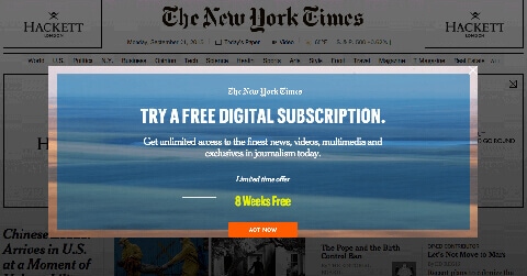
Source: New York Times
Why this exists: Many sites would really like you to sign up for something (such as a newsletter) or to Like their page on Facebook. However, such pop-ups often show up way too early, before you can even read a single word.
The unwanted consequences are: Especially annoying. Pop-ups like this often cover the entire page or important content – and if you think of a smaller smartphone screen, you’ll be even more annoyed. You’ll have to go and hunt for the button to close the pop-up, and if nothing else did before, that hunt will take all the fun out of the visit. After all, there’s one button every user will always find: the one to close the window altogether.
Which lead to: Once again, low conversion rates, and sometimes even a damaged brand. Here’s an amusing collection of bad examples.
(All right, we have to admit: We use a pop-up on some of the pages on this website. However, it only shows up when you leave the site, we never show it on mobile devices, and if you close it, it won’t show up again for the next 30 days.)
Push Notifications
They are the evil twin brother of pop-ups (and often appear alongside). As if the pop-up hasn’t already been annoying enough, push notifications take this one step further.
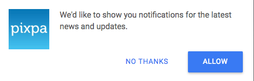
Why it exists: similarly to app notifications it’s an easy and direct way to push information to your screen.
The unwanted consequences are: If you agree to receive them, they will haunt you even when you’ve already left the website bothering you whenever the marketing team thinks it’s appropriate (which usually is never).
Which lead to: you never accepting them and not trusting the websites who offer them anymore.
Hamburger Menus
When you’re using a mobile device, you’ll know the hamburger menu: The three horizontal lines in the upper left corner of the display. These lines will show you the navigation area when tapped.
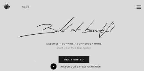
Source: Squarespace
Why this exists: Hamburger menus make sense on mobile devices where space is a premium commodity.
The unwanted consequences are: Nowadays, regular desktop websites receive the hamburger menu treatment, which confuses visitors because important navigation elements such as contact information, prices, or opening hours aren’t immediately accessible.
Which lead to: Important information is hidden away, and user engagement suffers because of it.
Complicated Captchas
You’ve done everything right – perfect clothes, perfect behavior – and yet, the bouncer gets in your face and goes: “You’re not getting in here!”
The same goes for Captchas you just can’t read. Is that a 1, a 7, a 6, or a capital G? Whatever you enter, you’ll get more of the same: “You’re not getting in here!”
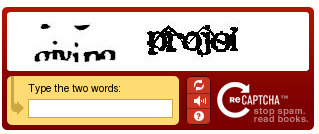
Why this exists: Captchas are a good line of defense against spam and bots, which every website owner will understand.
The unwanted consequences are: Many Captchas are difficult to read, or they don’t work.
Which lead to: Instead of protecting you from spam, these kinds of Captchas protect you from visitors you would actually want to welcome to your site. The visitors, however, won’t go for it – instead, they’ll leave your page, and perhaps write an annoyed comment on your company’s Facebook page.
You’ve probably seen some especially bad examples of your own, so here are two ways of dealing with bots and spam in a more user-friendly way: reCaptcha, Akismet.
Infinite Scrolling
And after scrolling for a while, you get to scroll some more, and then some more, and it never seems to end – no matter how much you’ve read, there’s more coming up from below! Go ahead, try it out for yourself.
Why this exists: Infinite scrolling is supposed to (and actually does) improve readability, and is especially beneficial to mobile users – the less a mobile user has to tap on tiny buttons, the better.
The unwanted consequences are: Information normally found in the footer might as well not exist at all. This is especially problematic when the footer is where you go for a login or contact information.
Which lead to: It renders the footer useless, but it still has to be loaded. Information and features become useless to your visitors.
Some Other Questionable Web Design Trends
Sticky headers make the menu structure permanently visible and scroll with the site. This is supposed to make navigation easier. However, if you add a cookie warning into the mix, this can hide a lot of content – especially on mobile devices.
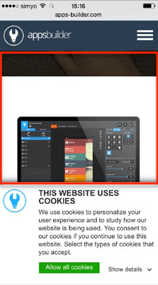
Source: Apps-Builder
Related articles: If you’ve ever shopped on Amazon, you’ll know the recommendations: “Customers Who Bought This Item Also Bought”. Other websites enjoy doing this, too, hoping to increase the time spent on their website by offering related articles. The difference here, however, is that these articles often show up in the middle of the current article, making for an annoying break while reading.
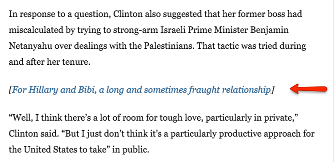
Source: Washington Post
And, last but not least, something that’s more unnecessary than annoying: The Google Plus share button. Google Plus is basically by marketing professionals for marking professionals, and if there’s any reason to add it at all, it’s in the name of search engine optimization (SEO). Google’s position of power makes it difficult for commercial sites to ignore the button, however – we’re guilty of this, too.
![]()
Conclusion
While designing your website, keep your visitors’ ability to keep an overview in mind, be sure to make hierarchies clear and the website’s structure plausible, don’t add unnecessary sharing buttons, and, of course, don’t forget to offer a responsive design. Reference related articles in the text itself and use hyperlinks instead of aggressively pushing a related article in the middle of another article.
Try and remember what your visitors would find the most user-friendly. Anything that distracts the visitor breaks his flow of reading, makes it difficult to find information, or causes him to wait, will most likely cause him or her to just give up and leave.
What other annoying web design trends have you come across? We’d love to hear from you, just leave us a comment!
This article was originally published in 2015 and has since been updated to add “Push Notifications” as the latest annoyance.
The author
Learn more about us
THE BEHIND THE SCENES OF THIS BLOG
This article has been written and researched following a precise methodology.
Our methodology