Somewhere in the broad landscape of behavioral psychology, there is the complicated and seemingly arbitrary science of color psychology. While research in this field cannot be labeled as an “exact science” due to the subjective and personal influence of the individual, color no doubt plays a profound role on our behaviors, perceptions and habits when it is associated with a business’s brand.
DID YOU KNOW? Consumers take less than 90 seconds to make a decision about a product and 62 to 90% of that decision is based on color alone!
It should now be clear that your brand is mercilessly judged quite literally in the blink of an eye, mostly due to the colors you choose to represent your business. Your website, then, must display a color palette that takes careful consideration into how users will perceive your brand. Color psychology can be a powerful tool in how you alter that perception and motivate action. For instance, some smart usage of color can influence the browsing decisions of your users based on conversion rates and their ease of navigation around your site.
General Color Influences on Our Perception
Let’s take a look now at the light spectrum and see how each color’s distinctive characteristics can affect a user’s psychology differently.
Red

Red is a color that inspires urgency, alertness, passion, and survival. Especially in Western culture, the color red alerts people to vital warnings; it sends off alarm bells; it commands attention. It’s no surprise then that red is one of the most effective colors to use for stimulating action—now! Unless the entire website is already red (generally not recommended), putting an element of a striking red tone anywhere on your page will surely draw a user’s attention to it first.
Useful Tips
- Known to increase the heart rate. Use responsibly.
- Used to persuade impulsive shoppers. “Red tag” clearance sales create a sense of urgency.
- Increases appetite. Used in restaurants and on websites in food industry.
- The color of Netflix and YouTube—probably because it stimulates a user to proactively watch more content, whereas a more subdued color would have the opposite effect.
- Not a good choice for airlines, finance, or other companies where trust and peace of mind are important.
Orange
Orange combines the urgency of red with the cheeriness of yellow, resulting in a color that is enthusiastic, fun, comforting, and confident. Using orange is a good choice for call-to-action buttons or any element that demands attention—perhaps in a better way than red because it is more friendly and inviting.
Useful Tips
- Creates a sense of fun, excitement, and childlike wonder. Often used in the field of sports and games. Also, look at Nickelodeon!
- Inspires confidence in call-to-action buttons.
- Suggests affordability and savings. Used by companies such as Easyjet, Amazon, Home Depot, and Namecheap.
Yellow

Yellow is often called the happiest color. It evokes excitement, friendliness, and optimism. Yellow lifts a person’s spirits and provides inspiration. Psychologists say that people often associate happy memories with the color yellow, so some companies use this color to capitalize on cheerful feelings.
Useful Tips
- Used in many baby products, as research shows it is the first color infants react to.
- The color of the sun. Associated with many outdoorsy and energizing brands.
- Use sparingly: too much yellow is known to create a sense of anxiety.
- Certain shades of yellow can inadvertently lead to feelings of nausea…
Green

Green is a color that inspires serenity, balance, wealth, and connection to nature. If your brand is in an environmental, eco-friendly, or organic field then green is the obvious choice for you. Interestingly, green is also used predominantly in the tech world. Darker shades are associated with money and finances. At the exact midpoint of the rainbow, green is the harmony of both the logical and the emotional; it is therefore an extremely versatile color.
Useful Tips
- Used in stores to relax and soothe customers.
- Inspires creativity.
- Has very few negative connotations compared to other colors.
- Represents growth and prosperity, making it an obvious choice for the finance sector.
Blue

Perhaps the most popular color in our society, blue instills productivity, trust, and calmness. Whereas red heightens the senses with a feeling of physical urgency, blue affects more the mental state with a sense of peace and serenity. It is a noninvasive color, so it doesn’t run the risk of being overpowering or obnoxious like some of the brighter colors can be. Blue creates a sense of trust and confidence, and so it is used predominantly in financial institutions, corporations, or fields where transparency is important.
Useful Tips
- The most universally liked color—even by those who are colorblind!
- Used around the workplace to increase productivity.
- Not recommended for food because it decreases appetite.
- Use it to say: “Slow down. Relax. Everything’s cool.”
Purple

The color purple evokes mystery, imagination, sophistication, and success. In many cultures it is often associated with spirituality and magic, as well as royalty and luxury. Many high-end items like jewelry and beauty products use purple for its elegance and classiness—and also to tailor to the feminine audience. Purple inspires new thought and creativity; you will see it used by companies that value wisdom, imagination, and introspection.
Useful Tips
- One of the most liked colors by women; one of the least liked colors by men.
- Inspires wealth, making it another preferred color for the finance industry.
- Not a great motivator for call-to-action elements—users will probably end up pondering the universe rather than clicking a button.
Pink
Pink is a rarely used color that creates compassion, romanticism, and youthfulness. At least in Western culture, pink is almost completely derided by men; for this reason it is used exclusively in more feminine brands. Pink is an emotional color, often used to spark romance and playfulness. Its nurturing quality makes it a good choice for therapists, charities and nonprofits, or products aimed at children.
Useful Tips
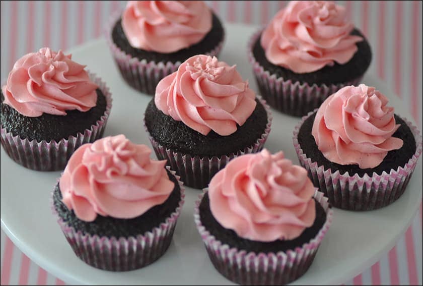
- A great choice for decadent foods like candy, cupcakes, ice cream or chocolates.
- Targets a specifically feminine audience.
- Creates a soothing and caring atmosphere.
- Use sparingly: too much pink can be draining and give a sense of immaturity.
Black

The complete absence of color, black instills authority, power, elegance, and seriousness. Black makes a bold statement, and so it must be used with caution. Too much of it can be overpowering or give a negative connotation. Its high contrast with other colors, especially white, makes it versatile as a background to draw attention to other elements. Black adds a sense of luxury and sophistication, and so it is used by brands that tailor only to the wealthiest of clientele.
Useful Tips
- Used by brands that pride exclusivity in luxury. See Gucci, Chanel, Lamborghini, and Jaguar.
- Good choice for high-end clothing and sleek technology products.
- Not a good choice for food, finance, or healthcare.
White

White is the combination of all colors at full intensity, creating a visual sense of perfection, purity, simplicity, and creativity. Honestly, can you really go wrong with white? Many websites use white abundantly, as it is good design sense to fill areas with whitespace to lend breathability in the layout. White can evoke classiness and elegance, used in storefronts and eCommerce shops to create a trendy and sophisticated atmosphere (think of Apple).
Useful Tips
- White is a blank slate; it inspires fresh ideas and new beginnings.
- Use white to forego design and call attention only to your product or content.
- Use it to open up overcrowded areas on your website.
- Too much white can create a sense of isolation or boredom.
Using Color For Conversions
Of course, there must surely be a reason for all this attention paid to choosing the right colors for your website. While the aesthetic appeal of a tasteful color palette has its place in overall user experience, the true aim of color psychology is to motivate action and increase conversion.
By understanding why certain colors inspire greater results than others, you can use this information to plan out the design and visual hierarchy of your website to maximize user interaction. Arming yourself with this knowledge often requires experimenting with different colors and testing to see which ones perform better, but ultimately you will need to know your audience in order to gain the best results.
Think about what service your brand offers and to what type of consumer you tailor to. Does your brand target impulsive shopaholics, or does it tailor more to careful, frugal shoppers? Are confidence and trust important cornerstones of your brand’s mission statement—or does your clientele care more for fun and excitement? Each of these factors can be associated with its own color, so your brand’s color scheme could effectively be determined by its own values and user base.
Gender Preference
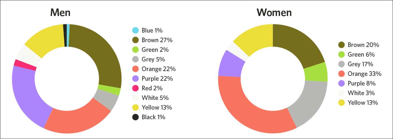
An obvious indication of your audience has to do with its gender, and it’s no surprise that men and women differ in their color preferences. In general, women tend to prefer softer colors and tints, gravitating towards blue, purple, and green. Men generally like bolder colors and shades, preferring blue, green, and black.
A research project conducted by Joe Hallock shows some interesting findings related to color preference by gender:
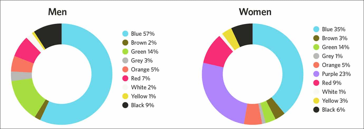 Men and women’s favorite colors. Image source.
 Men and women’s least favorite colors. Image source.
I have no idea why the world loves blue so much, but it seems to be a pretty safe bet you’ll make a lot of people happy by including it somewhere on your website. Also, poor orange…
Are Certain Colors Really More Effective Than Others?
Marketing agencies tend to get lost in the details with A/B testing. Through case studies of experimenting with color changes on websites and measuring the differences in conversion rates, many marketers rush to the claim that certain colors are simply more effective than others at increasing user action. This leads to bold declarations like a “Big Orange Button” is the future of call-to-action buttons—as if any other color is and forever shall be inferior to the almighty BOB.
Countless businesses flaunt ecstatic results from altering colors to increase conversions. So often we hear staggering claims like “sales went up 175% by switching from a green button to a yellow one!” Yet is it really the mere switch in color that is responsible for the huge shift in success—or are there other psychological factors at play?
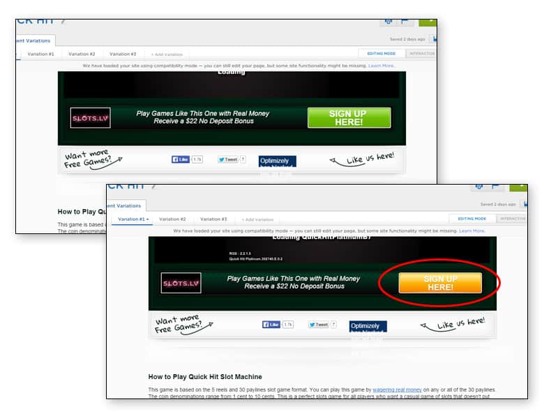 The original green CTA button on VegasSlotsOnline.com was swapped out to yellow, which they claimed increased conversion by 175%.
Looking at the above example, it seems a bit shortsighted to jump up and profess the miraculous powers of the color yellow to businesses everywhere. It would be a mistake to assume this simple shift in color can provide universal results to websites all across the Internet still using green buttons. While the specific color you choose invariably has its importance, it is also vital to notice the context in which these colors are used.
Contrast Makes a Difference
Contrast can affect a user’s perception just as much as color tone. Again, look at the above example and try to infer maybe why a yellow button would motivate greater user action compared to a green one. Based on the green background of the banner—and perhaps throughout the rest of the website’s color palette—a green CTA button only gets lost in the uniformity. It looks like it’s just additional copy, offering nothing attention-grabbing that commands “Hey! Click me!” A golden-yellow hue is the perfect choice in this context: it pairs well with the green background and, most importantly, grabs the user’s eyes and entices them to point their cursor over it.
When we’re absorbed in the same color for a while, our eyes naturally look for the opposite color as a visual break. These complementary colors stand out from each other with the highest contrast, and so they are most effective for website elements like CTA buttons alongside main text. Therefore, it is wise to consider the contrast of your own website’s color scheme—rather than blindly following another brand’s lead with their amazing color-shifting results.
QUICK TIP: Our eyes naturally go to the brightest color first. Blue, green, and cyan have a tendency to recede when placed alongside warmer colors like yellow, orange, or red. Use discretion when you want a certain color to direct a user’s attention.
Conclusion
The colors of your website say a lot about the values and clientele of your brand. Choose the right ones, and you will enjoy improved conversions and user interactivity. Choose the wrong ones, however, and you may isolate your audience or leave them confused and inactive. Deciding on your color scheme is about more than just picking the colors that “look nice”. There are profound psychological and subconscious meanings behind each color—and in some ways they can influence your audience to an even greater degree than the quality of your product or service.
If content is king, then color is surely queen.
The authors
Learn more about us

THE BEHIND THE SCENES OF THIS BLOG
This article has been written and researched following a precise methodology.
Our methodology